Appearance
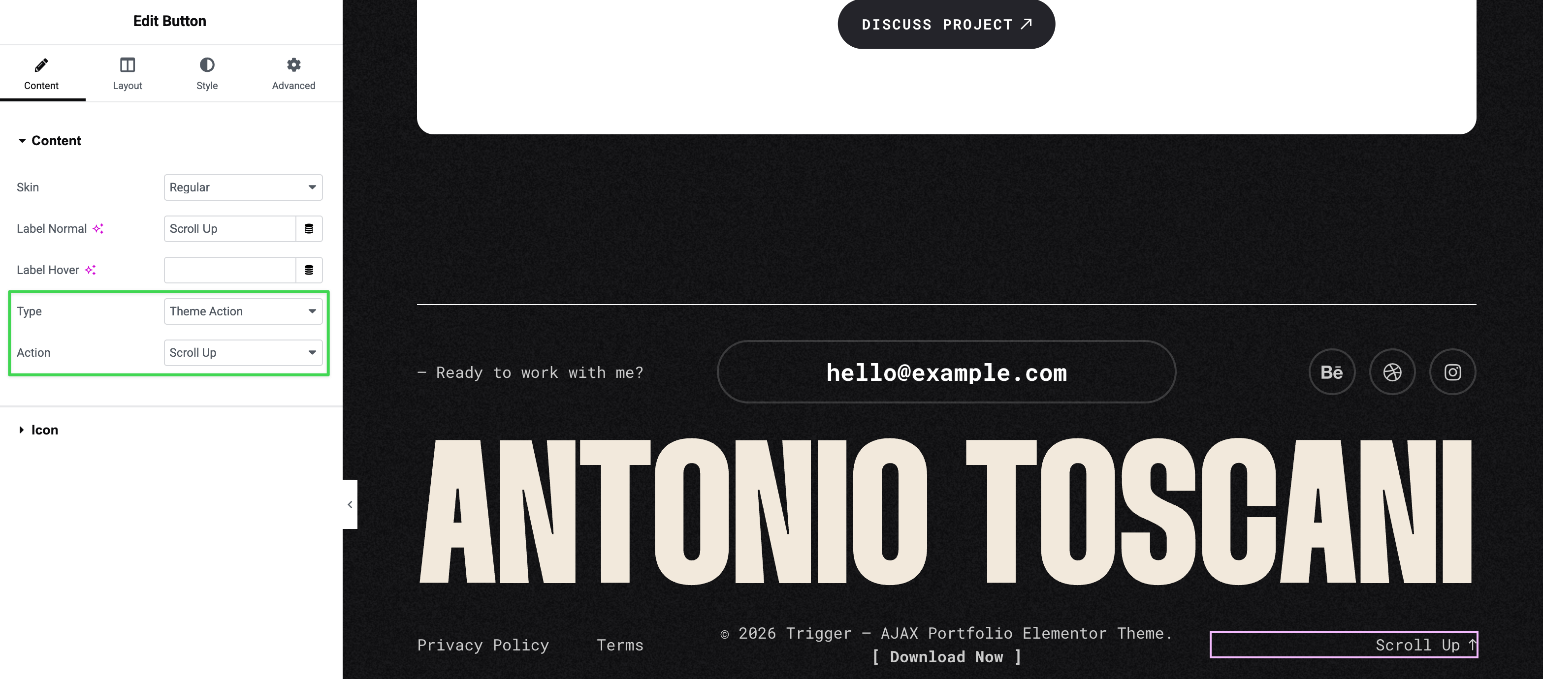
Button Theme Actions
The Button widget includes a Theme Action type that provides pre-configured interactive behaviors—no coding required.
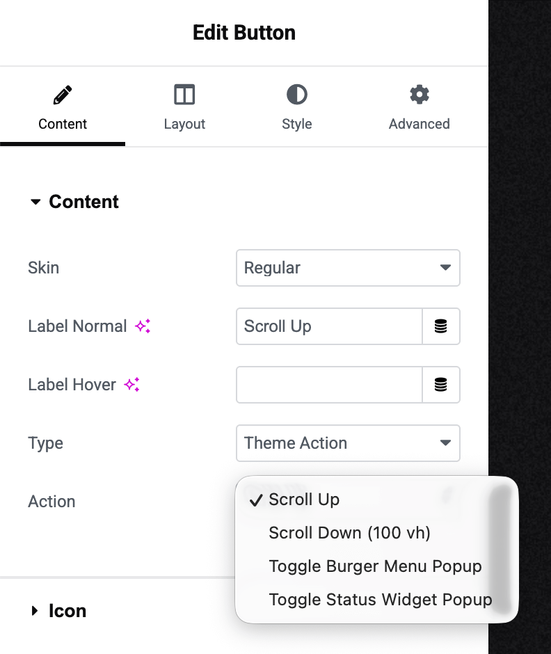
Available Actions
The Action dropdown offers four built-in options:
Scroll Up Smooth scroll to the top of the page. Perfect for back-to-top buttons in footers or floating navigation elements.
Scroll Down (100 vh) Scroll down one full viewport height. Ideal for "Explore More" or "See Below" buttons on landing sections.
Toggle Burger Menu Popup Open or close the navigation menu. Useful when you want to trigger the menu from a custom-designed button rather than the default burger icon.
Toggle Status Widget Popup Open or close the Status widget popup. Allows triggering the status display from custom CTAs or links throughout your site.
How to Use
Add a Button widget to your page:
Then configure it:
- Type → Select "Theme Action"
- Action → Choose your desired action from the dropdown
- Customize the button's label and appearance as needed
Advanced: JavaScript API
For developers, you can trigger these actions programmatically using the global App API:
javascript
// Scroll to top
window.triggerApp.doAction("scroll_up");

// Scroll down one viewport
window.triggerApp.doAction("scroll_down");

// Toggle burger menu
window.triggerApp.doAction("toggle_burger_menu_popup");

// Toggle status popup
window.triggerApp.doAction("toggle_status_popup");
Useful for custom implementations or integration with third-party scripts.