Appearance
Fluid Typography & Spacing
Fluid design lets your typography and spacing scale smoothly across all screen sizes — from phones to ultrawide monitors — without manually setting values for each breakpoint.
Think of it like global color presets — but for font sizes, padding, and layout gaps. This responsive design technique is used by top creative agencies who demand pixel-perfect quality on every device, not just the common breakpoints.
The Problem with Breakpoints
Traditional Elementor design requires setting separate values for mobile, tablet, and desktop. This approach has two issues:
- Awkward gaps in between — Your design looks perfect at specific screen widths, but what about 900px? Or 1100px? Those in-between sizes often look off.
- Time-consuming — Updating styles across multiple breakpoints for every element is repetitive and error-prone.
How Fluid Design Solves This
Instead of fixed breakpoint values, you define just two — a minimum and a maximum. The Fluid Design System for Elementor plugin handles the rest — automatically calculating smooth scaling between your values. This standalone plugin works with any Elementor theme — it's required by Trigger and installs automatically during demo import.
Example: A heading set to 24px ~ 72px will be 24px on small screens, 72px on large screens, and scale proportionally at every size in between.
Learn More
For a deeper explanation and video tutorials, see the Fluid Design System for Elementor Guide.
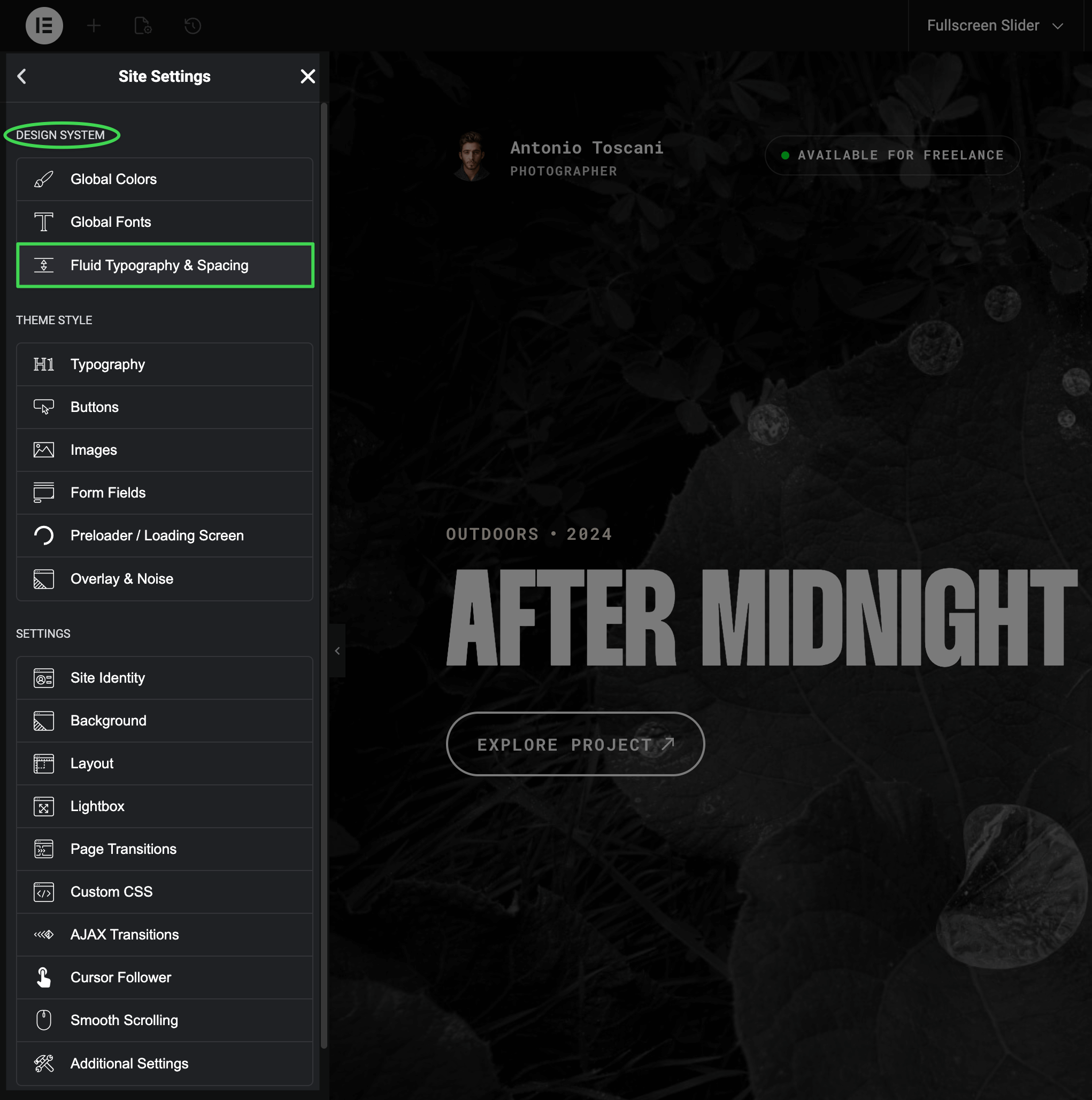
How to Access this Panel
Open Site Settings panel in Elementor using this guide Accessing Theme Options Panel and select Fluid Typography & Spacing.
Pre-configured Design System
Trigger includes a complete fluid design system imported with the demo content. These presets are used throughout the demo pages to maintain consistent, responsive styling — the same approach professional UI/UX designers use to create polished, cohesive websites. By using these presets, your custom pages will blend seamlessly with the rest of the design.
Typography Presets
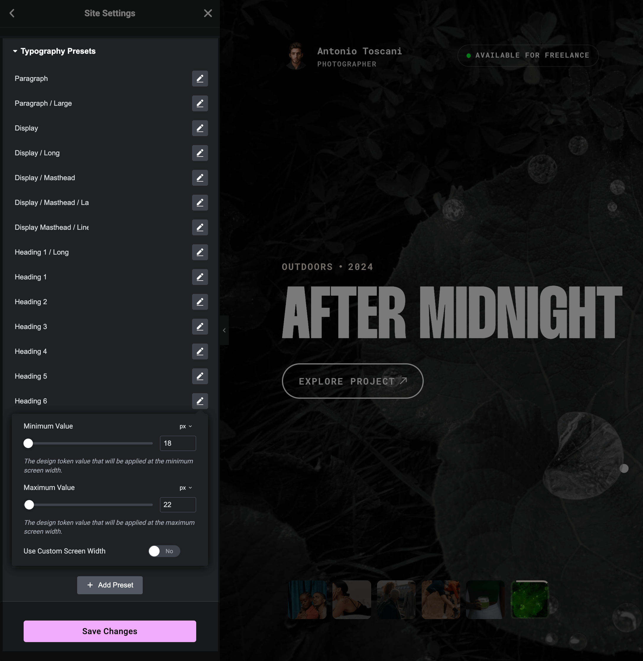
Font size presets for different text elements:
- Paragraph — body text sizes
- Display — large hero text with variants (Masthead, Long, Line)
- Heading 1–6 — standard heading hierarchy
- UI Labels — interface text (Medium, Small)
- Menu Items — burger menu typography
Spacing Presets
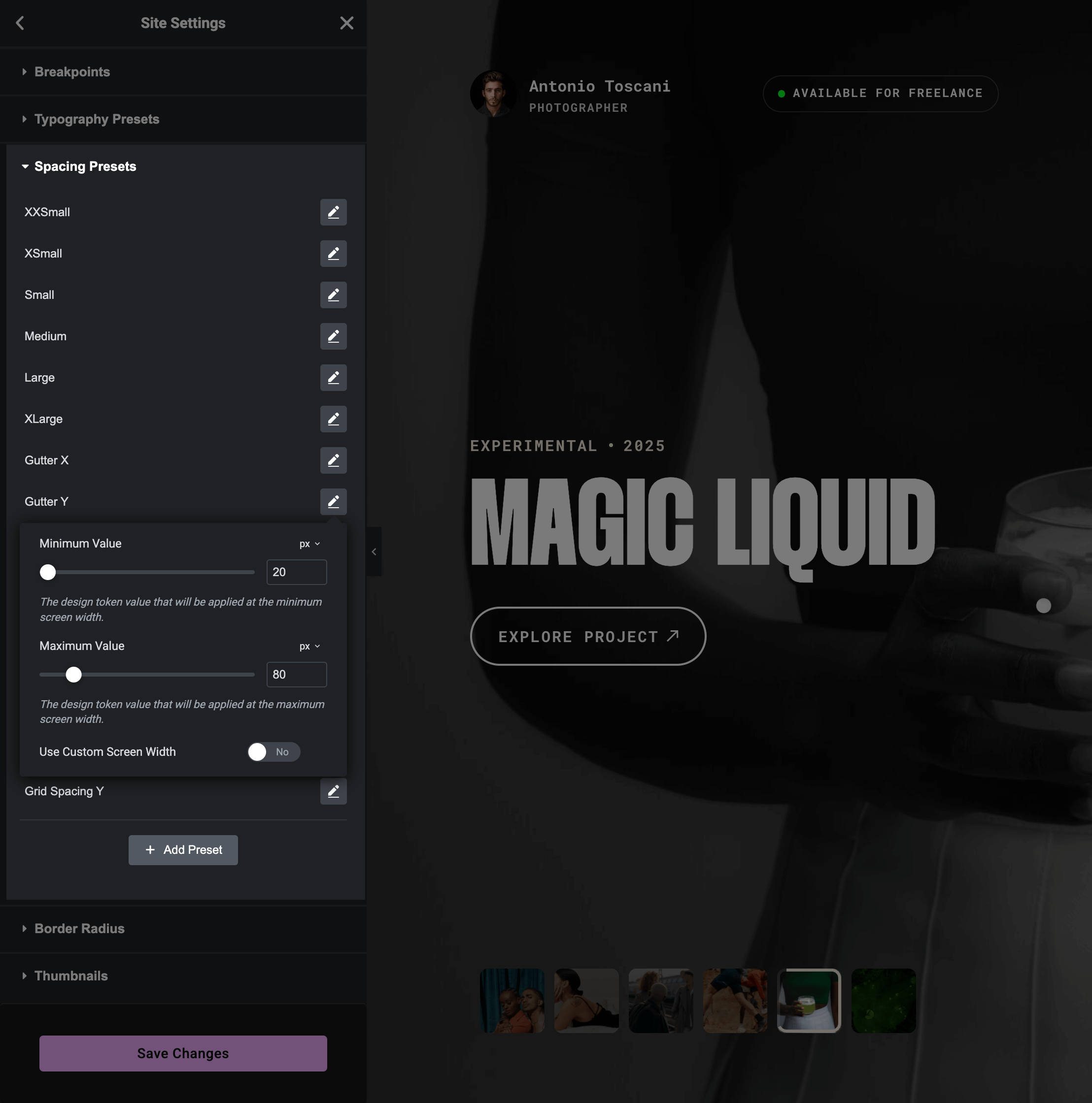
Padding, margin, and gap presets:
- XXSmall to XLarge — general-purpose spacing scale
- Gutter X / Y — layout gutters
- Grid Spacing X / Y — grid layout gaps
- Columns Gaps — column spacing variants
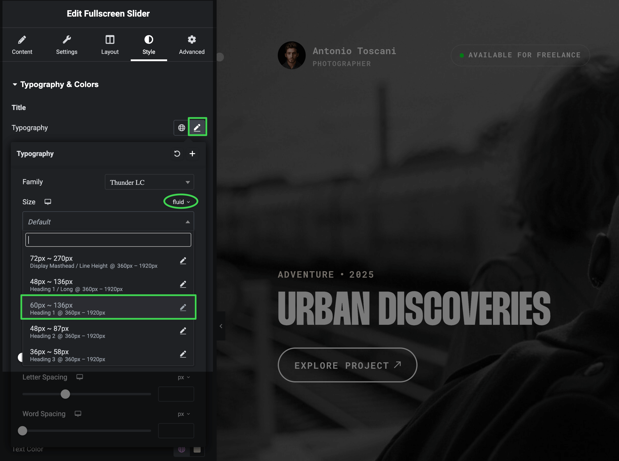
Using Fluid Presets
To apply a fluid preset to any element:
- Select an element in Elementor (heading, section, container, etc.)
- Find the control you want to make fluid (font size, padding, gap)
- Click the unit dropdown and select fluid
- Choose your preset from the list
Fluid Typography Example
Fluid Spacing Example
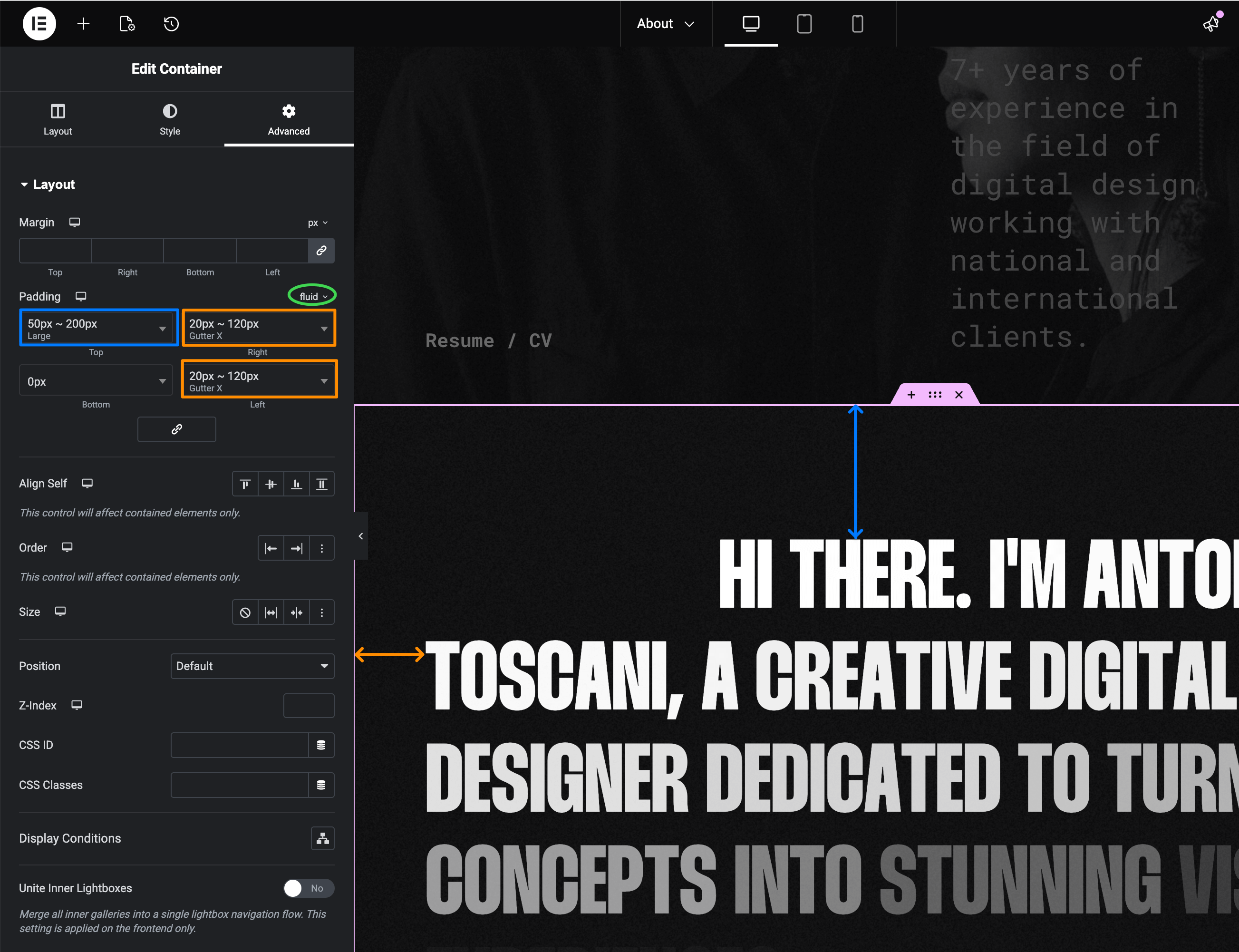
The element will now scale smoothly across all screen sizes — no more fiddling with tablet and mobile values separately.
Customizing Presets
You can edit any preset by clicking the pencil icon next to it. Adjust the min/max values to match your design needs.
Advanced Features
The Fluid Design System for Elementor plugin offers additional capabilities:
- Inline values — Experiment with fluid values directly in controls (
20px ~ 100px) without visiting Site Settings — perfect for quick testing - Save as Preset — Found a value you like? Convert it to a reusable preset with one click, instantly available across your entire site
- Custom groups — As your design system grows, organize presets by purpose (e.g., "Section Space", "Grid Gaps") in the Admin Panel (Elementor → Fluid Design System)
See the Plugin Documentation for details.