Appearance
Header
The header appears at the top of every page and contains your site logo, navigation menu, social icons, and optional elements like a contact button. This guide shows how to customize the Trigger header in WordPress and Elementor — including sticky behavior, smooth animations, spacing, and flexible styling options.
How to Access this Panel
- Go to Elementor → Theme Builder → Header
- Edit the header template
For more on accessing templates, see Editing Site Templates.
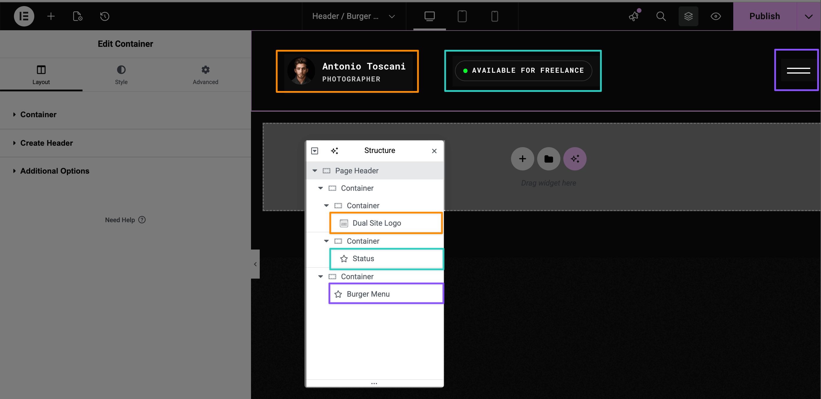
Understanding Header Structure
The Trigger header is built on an Elementor Container with several widgets inside:
| Element | Purpose |
|---|---|
| Header Container | The main wrapper with sticky settings |
| Dual Site Logo widget | Displays your logo with optional light/dark variants |
| Burger Menu widget | Navigation that opens in a fullscreen overlay |
| Status widget | Optional clickable label for contact forms or other content |
Adjusting Header Options
▶️ Step 1.
Open Navigator (Structure panel) and select the top-level Page Header container.
▶️ Step 2.
In the left sidebar, activate the Layout tab and expand the Create Header section.
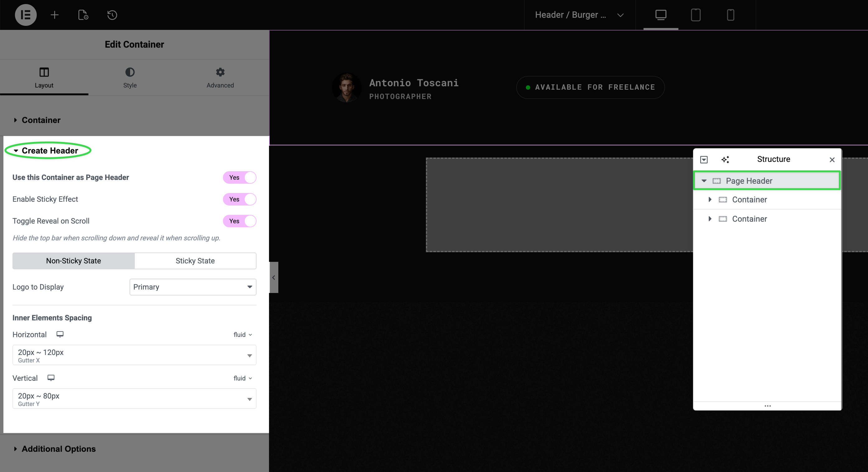
Here you'll find:
| Option | What it does |
|---|---|
| Use this Container as Page Header | Enables header mode for this container |
| Enable Sticky Effect | Makes header stick to top when scrolling |
| Toggle Reveal on Scroll | Hides header when scrolling down, reveals when scrolling up |
One Header Per Page
Only use one header container per page. Multiple headers may not work as expected — the theme is designed for exactly one header instance.
Non-Sticky vs Sticky State
Within the Create Header section, you'll see two tabs:
- Non-Sticky State — settings for when the page first loads (before scrolling)
- Sticky State — settings for when the header becomes sticky
Each tab lets you choose:
- Which logo version to display (Primary or Secondary, if you have both set)
- Inner element spacing (horizontal and vertical)
Changing Site Logo
There are three ways to change your site logo:
Option 1: Via Customizer (Recommended)
The standard WordPress way. Go to Appearance → Customize → Site Identity and upload your logo.
For step-by-step instructions, see Uploading Site Logo.
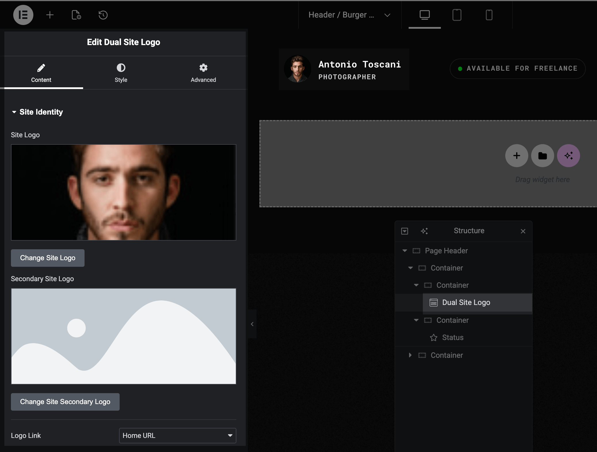
Option 2: Via the Logo Widget
▶️ Step 1.
Select the Dual Site Logo widget in Navigator.
▶️ Step 2.
The widget is a Global Widget — click the Edit button to modify it.
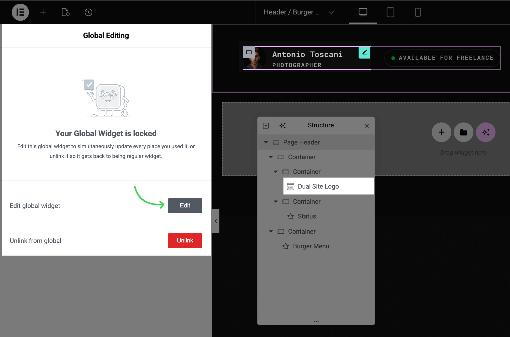
▶️ Step 3.
In the Content tab, click Change Site Logo or Change Site Secondary Logo.
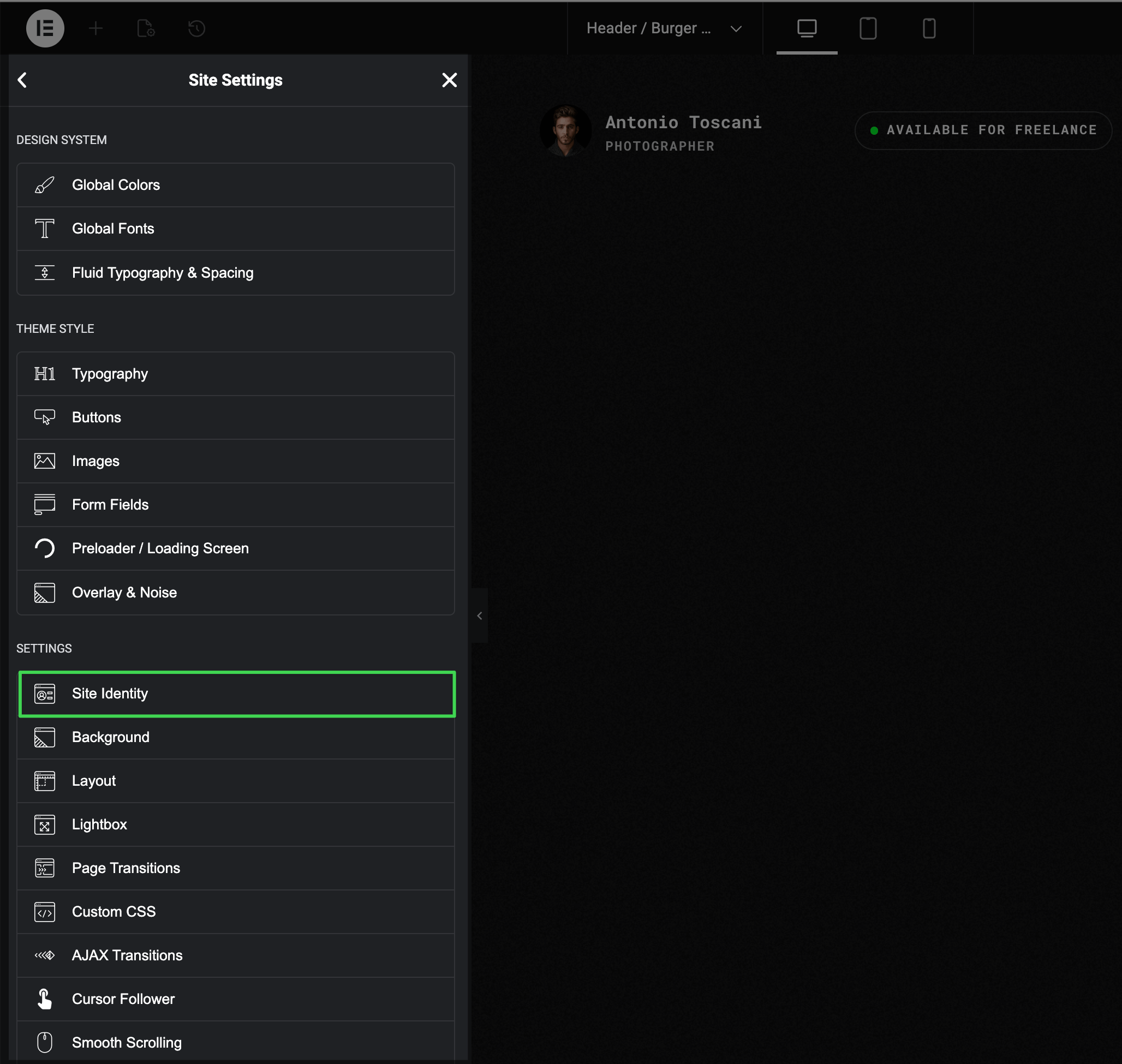
Option 3: Via Elementor Site Settings
▶️ Step 1.
Open Site Settings in Elementor (see Accessing Theme Options Panel).
▶️ Step 2.
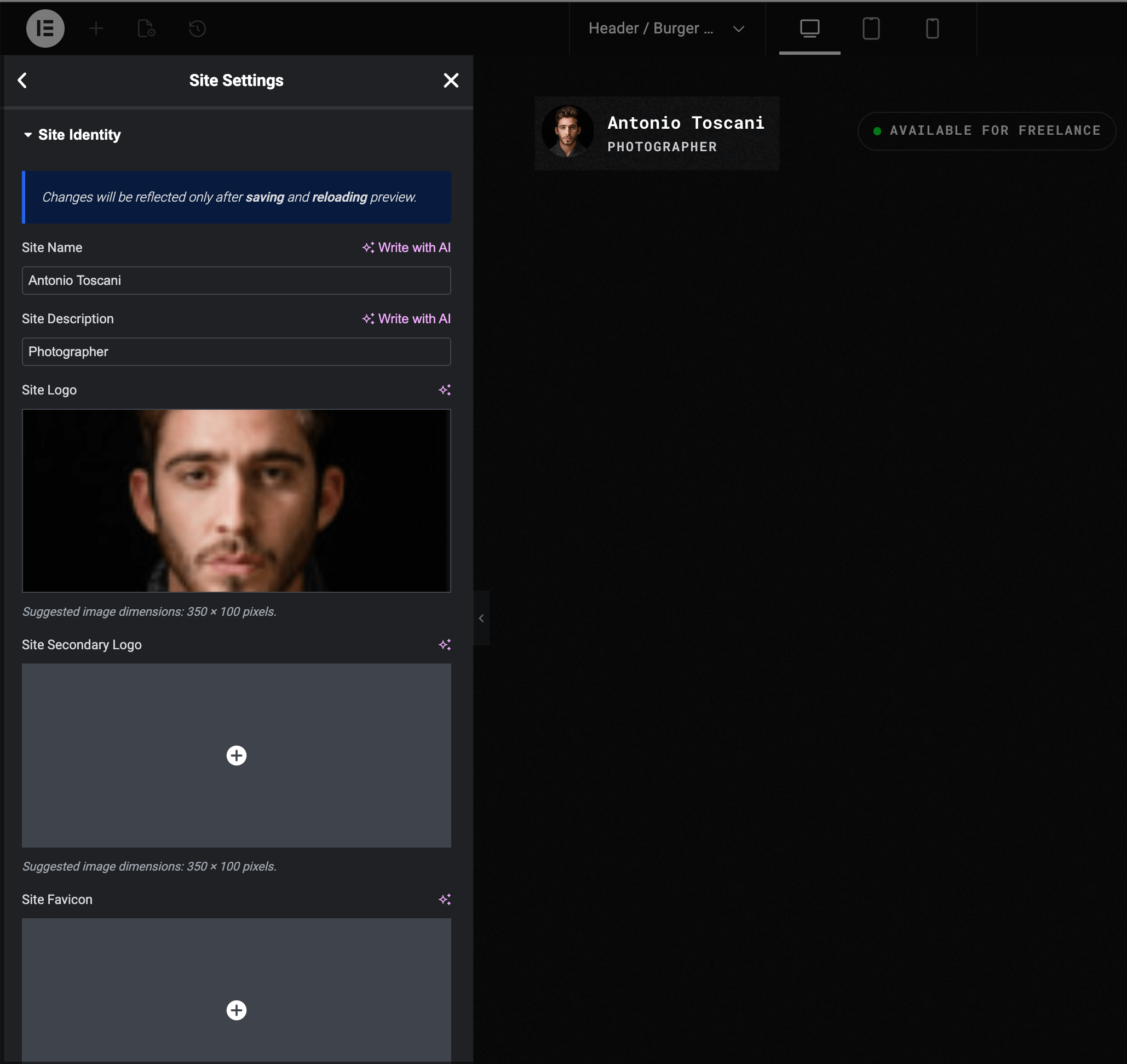
Under Settings, click Site Identity.
▶️ Step 3.
Upload your Site Logo and optionally a Site Secondary Logo for the sticky state or dark backgrounds.
Changing Logo Size
▶️ Step 1.
Select the Dual Site Logo widget in Navigator.
▶️ Step 2.
Go to the Style tab.
▶️ Step 3.
Expand the Spacing & Sizes section.
▶️ Step 4.
Adjust the Logo Max Height control.
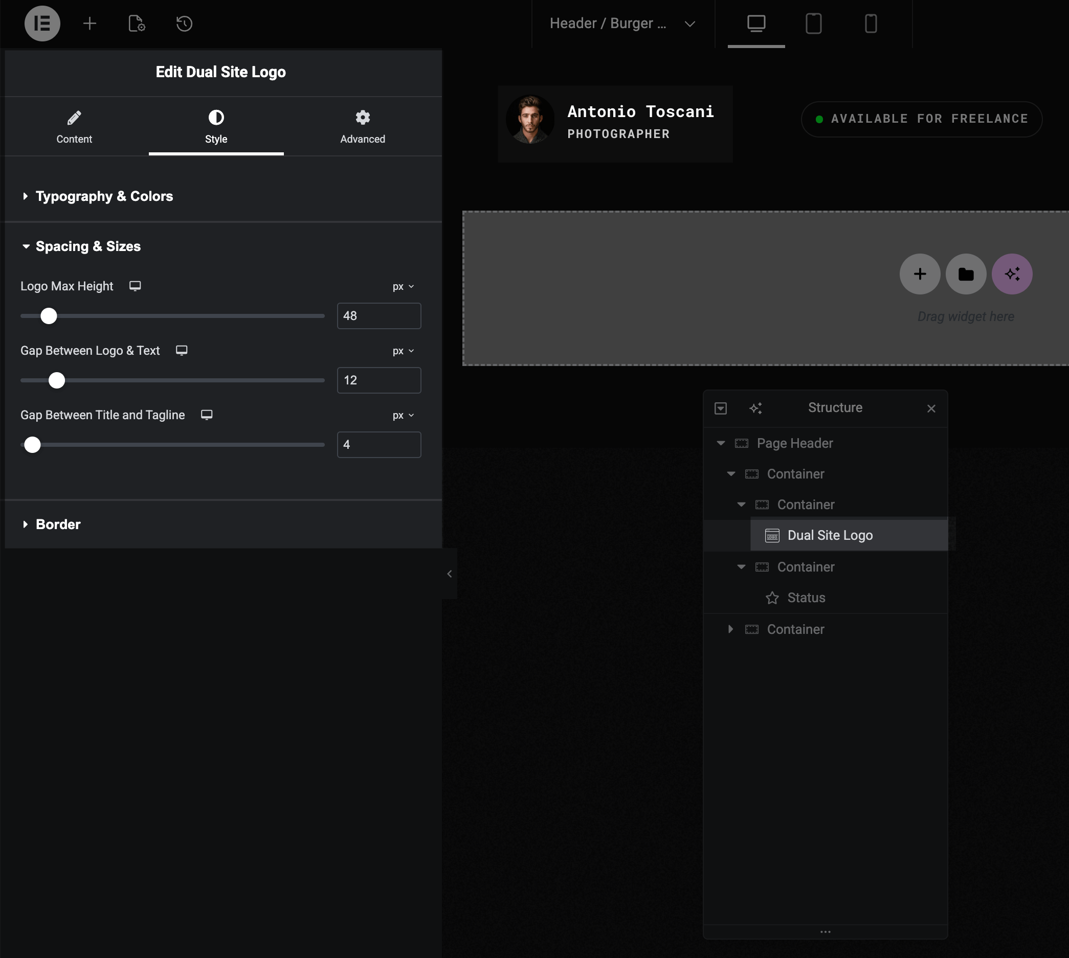
TIP
The width adjusts automatically based on your logo's aspect ratio.
Changing Sticky Header Background Color
When you scroll, the header becomes "sticky" and can have a different background color than the initial state.
▶️ Step 1.
Select the header container in Navigator.
▶️ Step 2.
Go to the Style tab → Background section.
▶️ Step 3.
Look for the Sticky Header Styles heading.
▶️ Step 4.
Set your preferred background color or gradient.
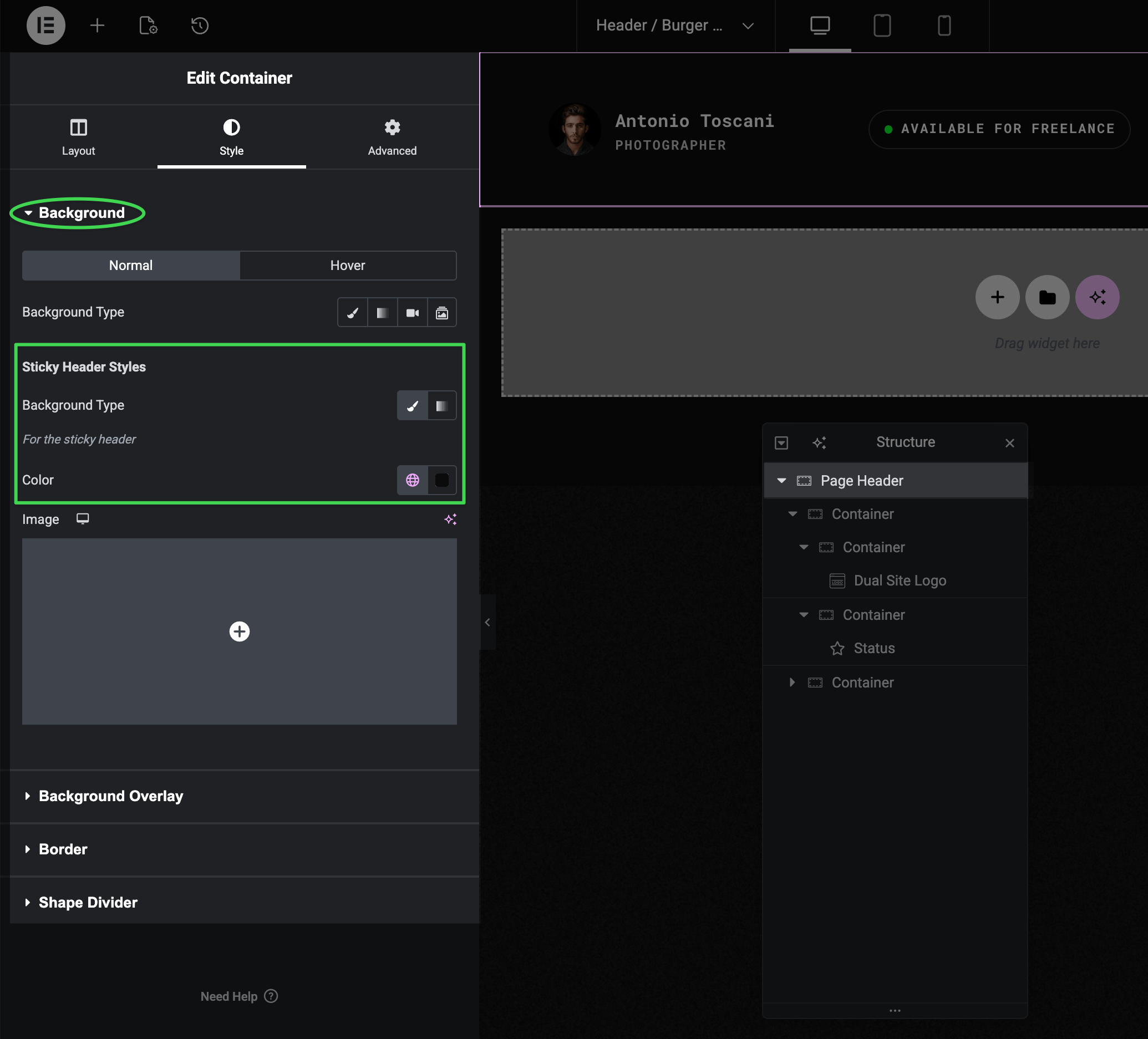
Common Issue
If your sticky header has the wrong color when scrolling, check these sticky-specific background settings — they're separate from the regular background controls above.
Adjusting Header Spacing
The header uses fluid spacing for responsive scaling. There are two places where spacing is configured:
Inner Elements Spacing (Create Header Section)
Select the root Page Header container and look in the Layout tab under Create Header → Inner Elements Spacing.
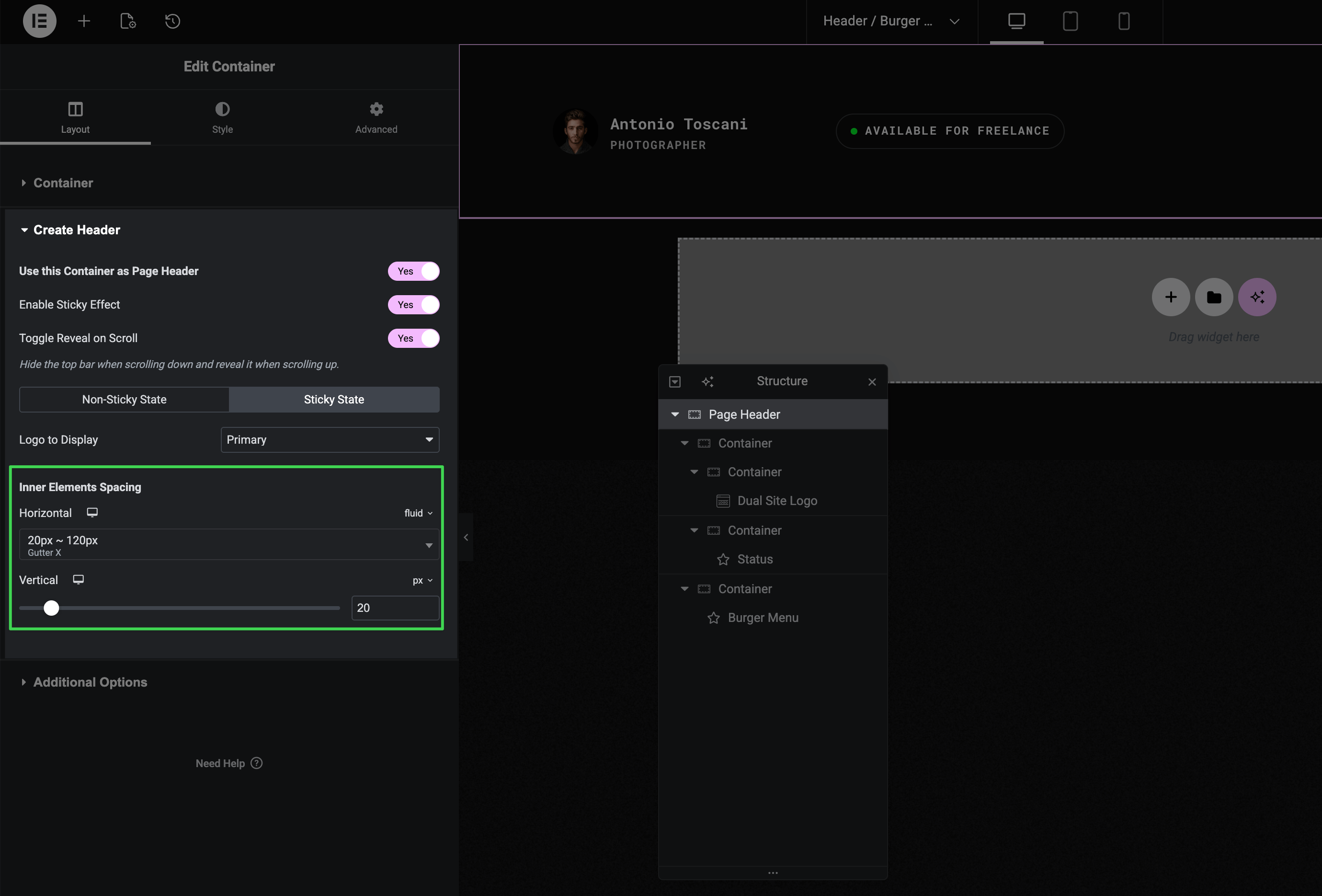
- Horizontal — controls horizontal space between header elements. Can use fluid presets (e.g.,
20px ~ 120px) that scale smoothly with viewport width - Vertical — controls vertical padding (header height)
These values apply to both non-sticky and sticky states by default. Use the state tabs to set different values for each state.
Container Padding with Fluid Presets
For more control, you can configure padding directly on containers using fluid presets from the Advanced tab.
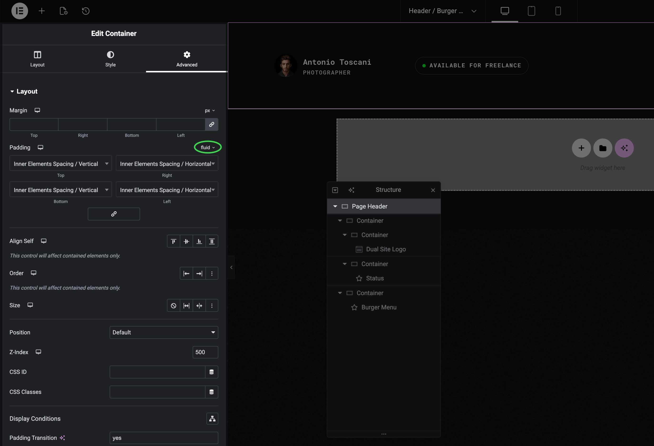
In Advanced → Layout → Padding, switch to fluid mode to access presets like:
- Inner Elements Spacing / Horizontal
- Inner Elements Spacing / Vertical
Padding Transition
When using fluid padding, enable Padding Transition (set to yes) for smooth animated transitions when the header changes state — for example, when it becomes sticky on scroll.
To learn more about fluid spacing and how it works, see Fluid Typography & Spacing.
Disabling Sticky Header
If you don't want the header to stick when scrolling:
▶️ Step 1.
Select the header container in Navigator.
▶️ Step 2.
Go to Layout tab → Create Header section.
▶️ Step 3.
Turn off the Enable Sticky Effect toggle.
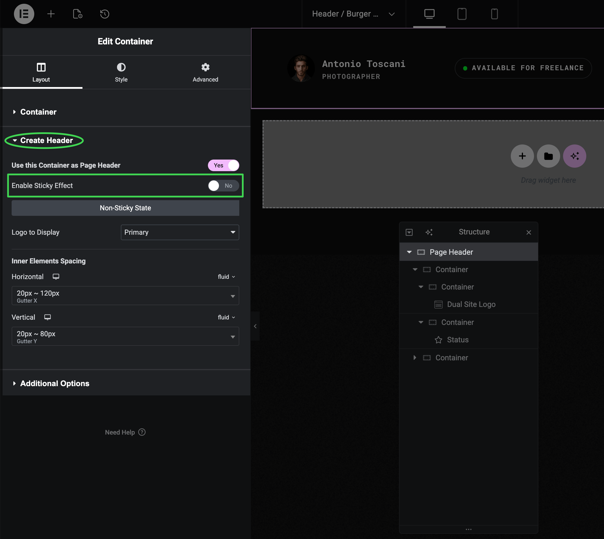
The header will scroll away with the page content.
Customizing Navigation Menu
Editing Menu Items
Menus are managed in WordPress at Appearance → Menus, not in Elementor. There you can add pages, reorder items, and create dropdowns.
For detailed instructions, see Editing Navigation Menus.
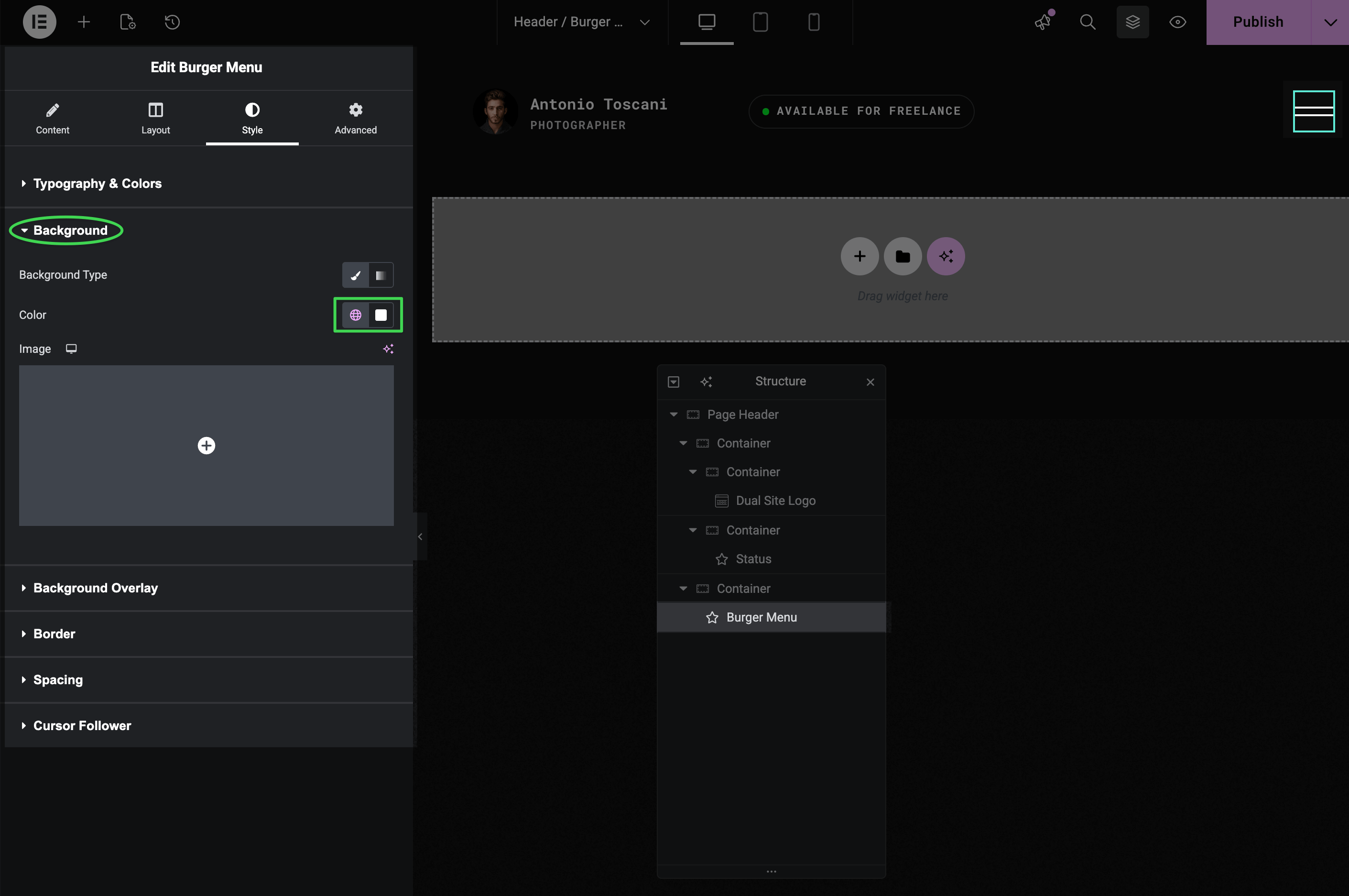
Customizing the Burger Menu Widget
Select the Burger Menu widget in Navigator to access its settings.
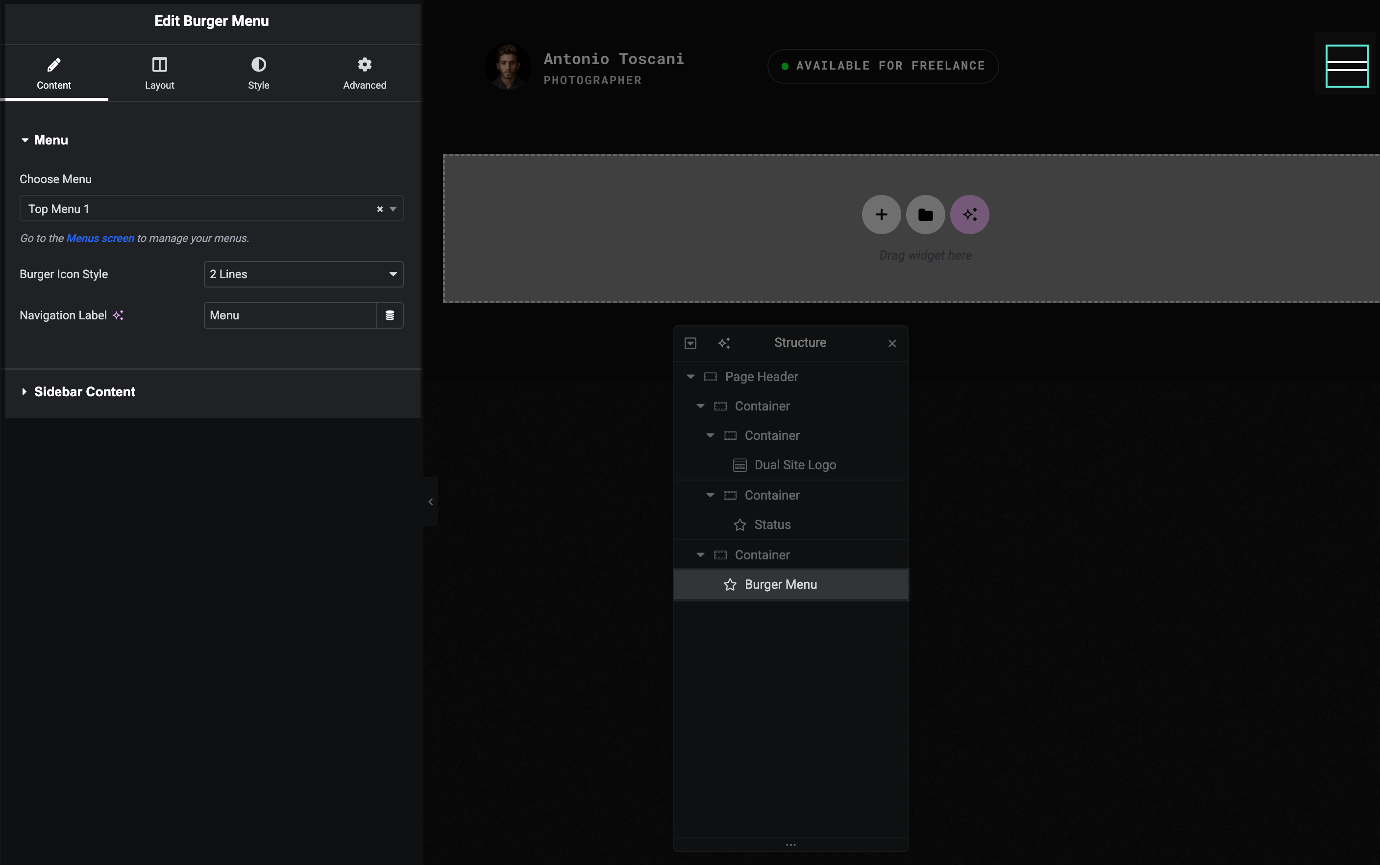
Content tab:
- Menu — choose which WordPress menu to display
- Burger Icon Style — 2 or 3 lines
- Navigation Label — text shown next to the burger icon
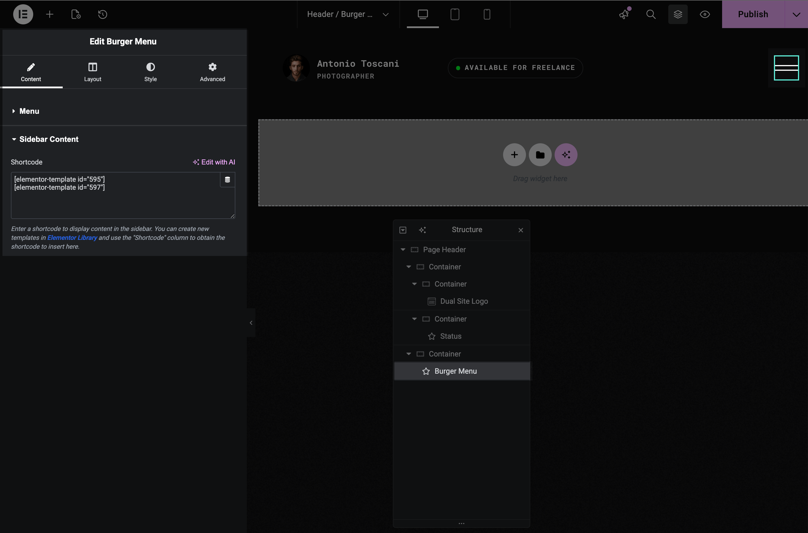
- Sidebar Content — shortcode for content displayed in the menu sidebar
Style tab:
- Typography & Colors — burger icon colors, menu item styling
- Background — menu overlay background color
- Border, Spacing, Cursor Follower — additional styling options
Changing Sidebar Content
The sidebar area (visible when menu opens) contains a call-to-action button and social icons. This content is loaded from an Elementor template via shortcode.
▶️ Step 1.
In the Burger Menu widget, find the Sidebar Content section and note the shortcode (e.g., [elementor-template id="595"]).
▶️ Step 2.
Go to Elementor → Templates → Saved Templates and find the matching template (e.g., "Menu Sidebar Content 1").
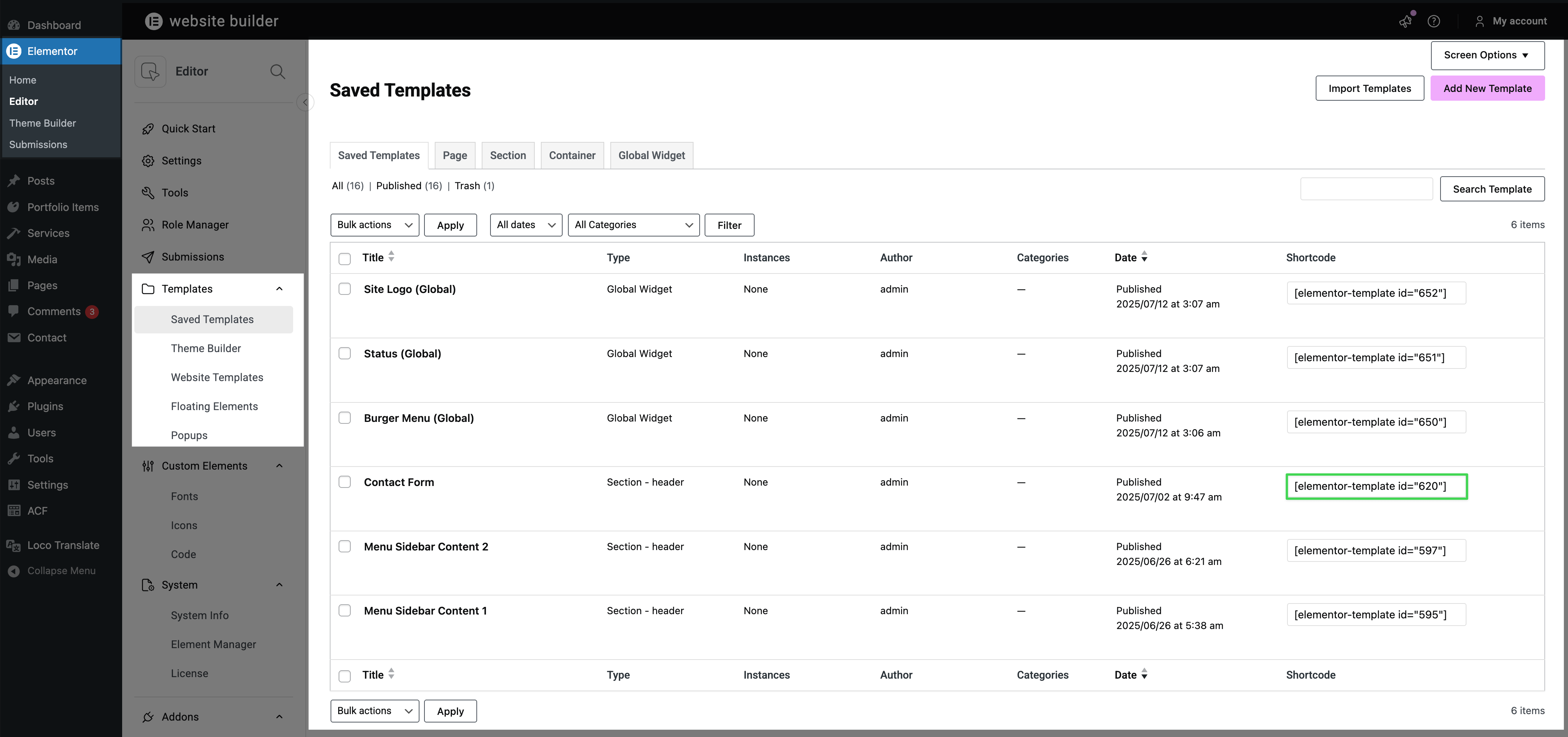
▶️ Step 3.
Edit the template to customize the button text, link, social icons, or add your own content.
TIP
You can change button labels, URLs, add or remove social icons, or completely redesign the sidebar layout using any Elementor widgets.
For more details on editing shortcode templates, see Editing Saved Templates.
Switching to Classic Menu Layout
Trigger includes two header variations:
- Burger Menu (default) — hamburger icon that opens fullscreen overlay
- Classic Menu — traditional horizontal/vertical menu visible on desktop
Using Classic Menu Site-Wide
▶️ Step 1.
Go to Elementor → Theme Builder → Headers.
▶️ Step 2.
Find the Classic Menu header template.
▶️ Step 3.
Click the conditions icon and set condition to Entire Site.
▶️ Step 4.
Remove the Entire Site condition from the Burger Menu template.
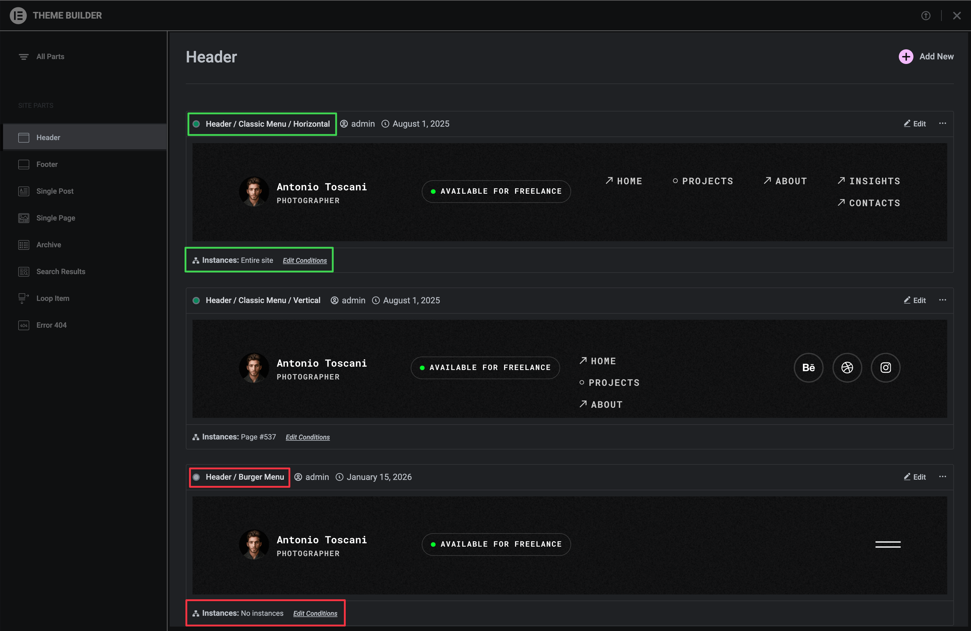
TIP
The Burger Menu widget is still present in Classic Menu headers for mobile devices — it's just hidden on desktop.
For more details on how display conditions work, see Templates Display Conditions.
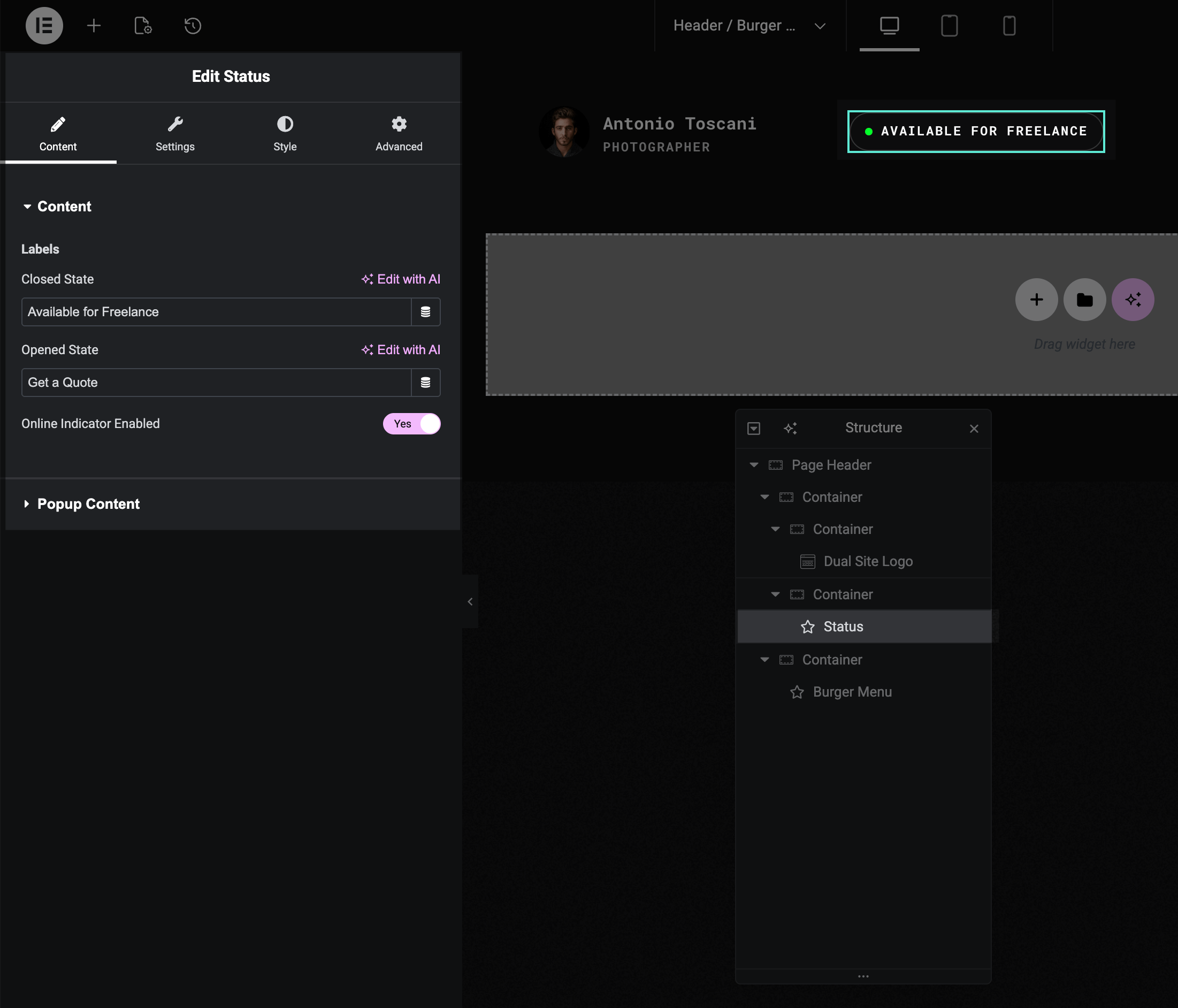
Using the Status Widget
The Status widget shows a clickable label (e.g., "Available for Projects") that opens a popup with custom content — commonly a contact form.
Changing Status Labels
▶️ Step 1.
Select the Status widget in Navigator.
▶️ Step 2.
In the Content tab, edit:
- Closed State label (e.g., "Let's Talk")
- Opened State label (e.g., "Close")
Theme Actions
The Status widget is one of several built-in theme actions. For more interactive button behaviors, see Button Theme Actions.
Changing Status Popup Content
▶️ Step 1.
In the Status widget, find the Popup Content section.
▶️ Step 2.
Note the shortcode (e.g., [elementor-template id="620"]).
▶️ Step 3.
Edit that template in Elementor → Templates to change the popup content.
For more details on editing shortcode templates, see Editing Saved Templates.
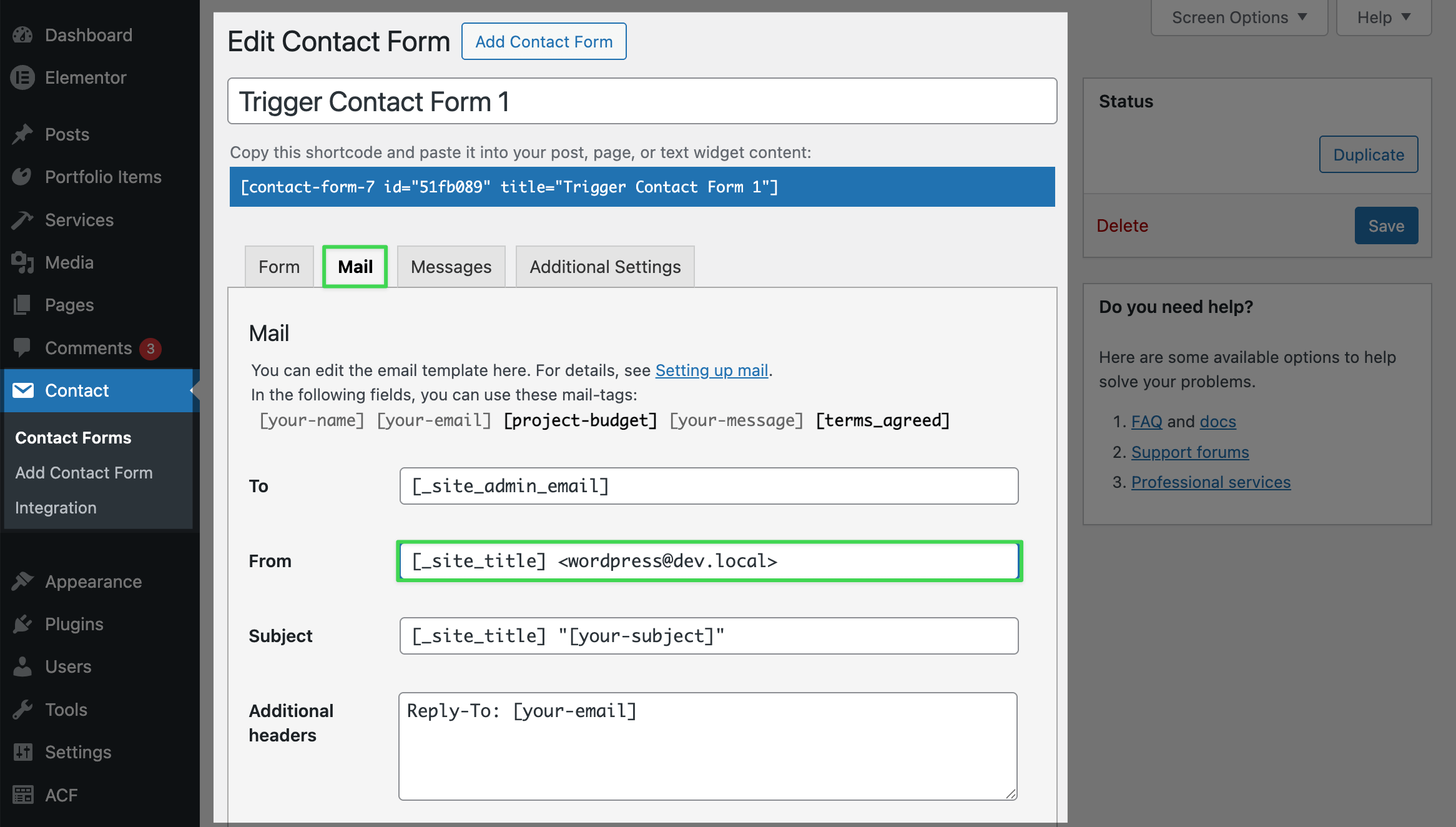
Making the Contact Form Work
The demo uses Contact Form 7:
▶️ Step 1.
Go to Contact → Contact Forms in WordPress admin.
▶️ Step 2.
Find and edit your contact form.
▶️ Step 3.
In the Mail tab, enter your email address.
▶️ Step 4.
Save changes.
Customizing the Form
You can add or remove fields, change labels, and customize settings in the Form tab. For more options, see the Contact Form 7 documentation.
Hiding the Header on Certain Pages
There are two ways to hide the header on specific pages:
Option 1: Use Canvas Template
Set the page's Elementor template to Canvas, which removes the header and footer entirely. This is useful for landing pages or special layouts.
See Pages & Templates for details.
Option 2: Add Display Condition Exclusion
Edit the header template and add an exclusion rule in the display conditions. This hides the header on specific pages while keeping the footer.
See Templates Display Conditions for details.