# Theme Additional Classes
Elementor allows you to apply classes to your sections or widgets, greatly extending the ability for custom styling.
There are some handy classes supported by Harizma that you can use to have consistent paddings and margins throughout your website. Here is the full list:
.section_pt
.section_pt-small
.section_pt-large
.section_pb
.section_pb-small
.section_pb-large
.section_mt
.section_mt-small
.section_mt-large
.section_mb
.section_mb-small
.section_mb-large
The first letter of the suffix stands for the type of indentation. The second letter indicates the direction. For example, .section_pt will give your section Padding Top, while .section_mb will give your section Margin Bottom.
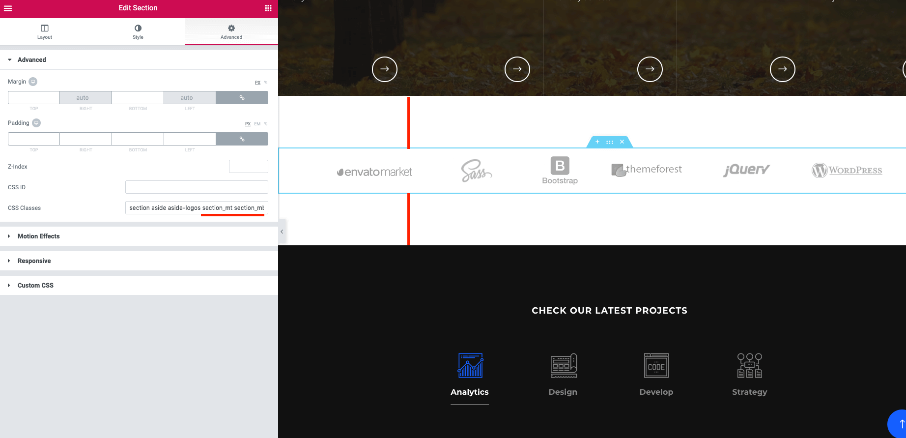
Advanced tab in ElementorThese classes fully handle the responsive experience. This means you don’t need to worry about adjusting every section's margins and paddings for mobile devices. Simply combine these classes the way you want and achieve a perfect look for your sections on smartphones and tablets.