# Extended Section Widget
One of the most time-consuming parts of the web design process is making the overall design look consistent. This includes consistent negative spacing and color themes across the entire website. The challenge becomes even bigger nowadays due to the huge variety of screen sizes, which require different margins and paddings to look nice.
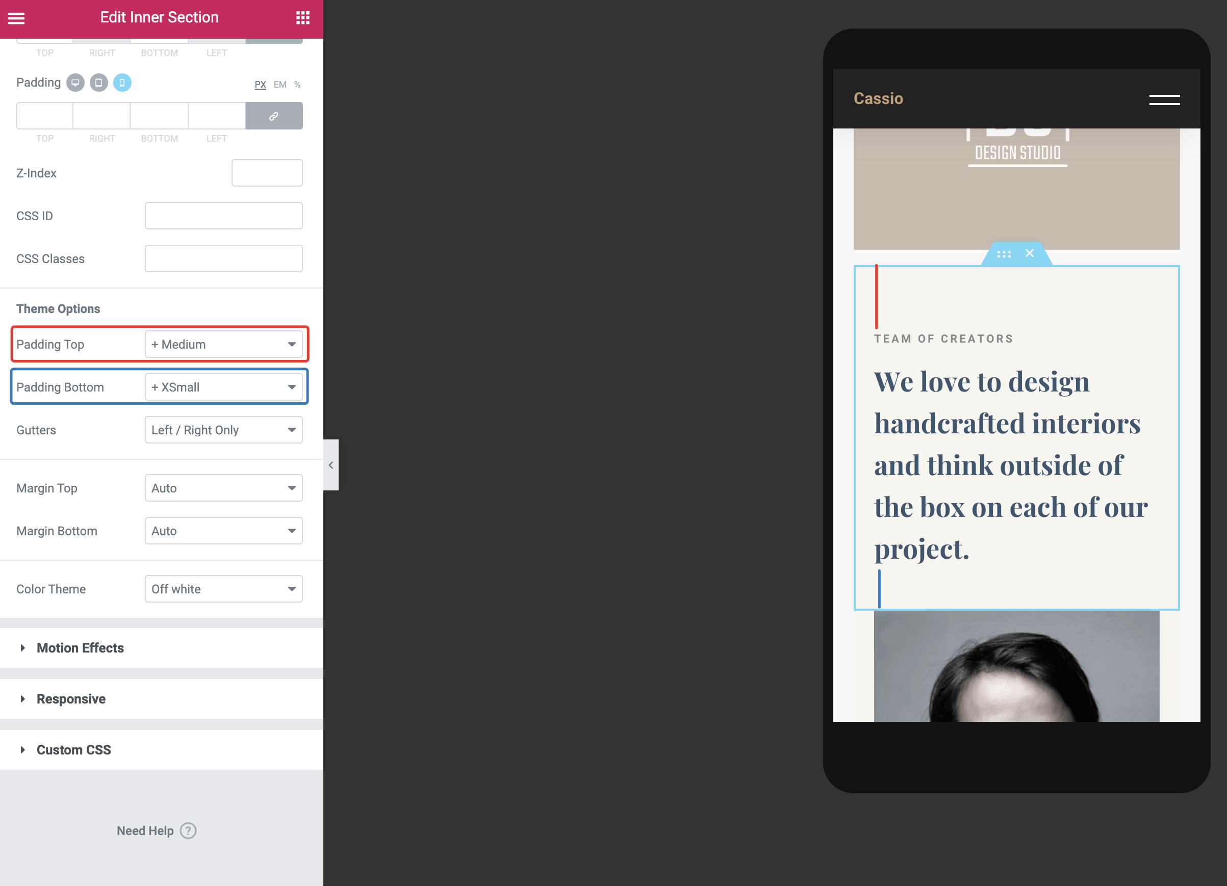
Cassio theme supports a very handy extension that simplifies the web design process. It offers presets for paddings, margins, and color themes. These presets are available from the standard Elementor Section widget in the Advanced tab.
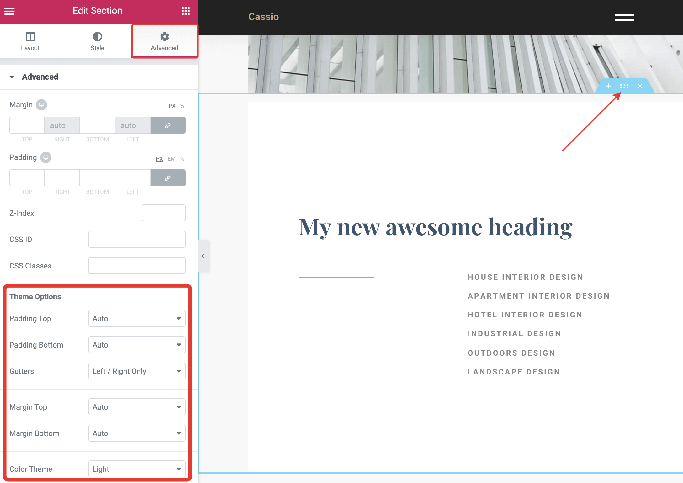
Using these options, you can set consistent spacing rules for all your sections and make them look nice and professional.
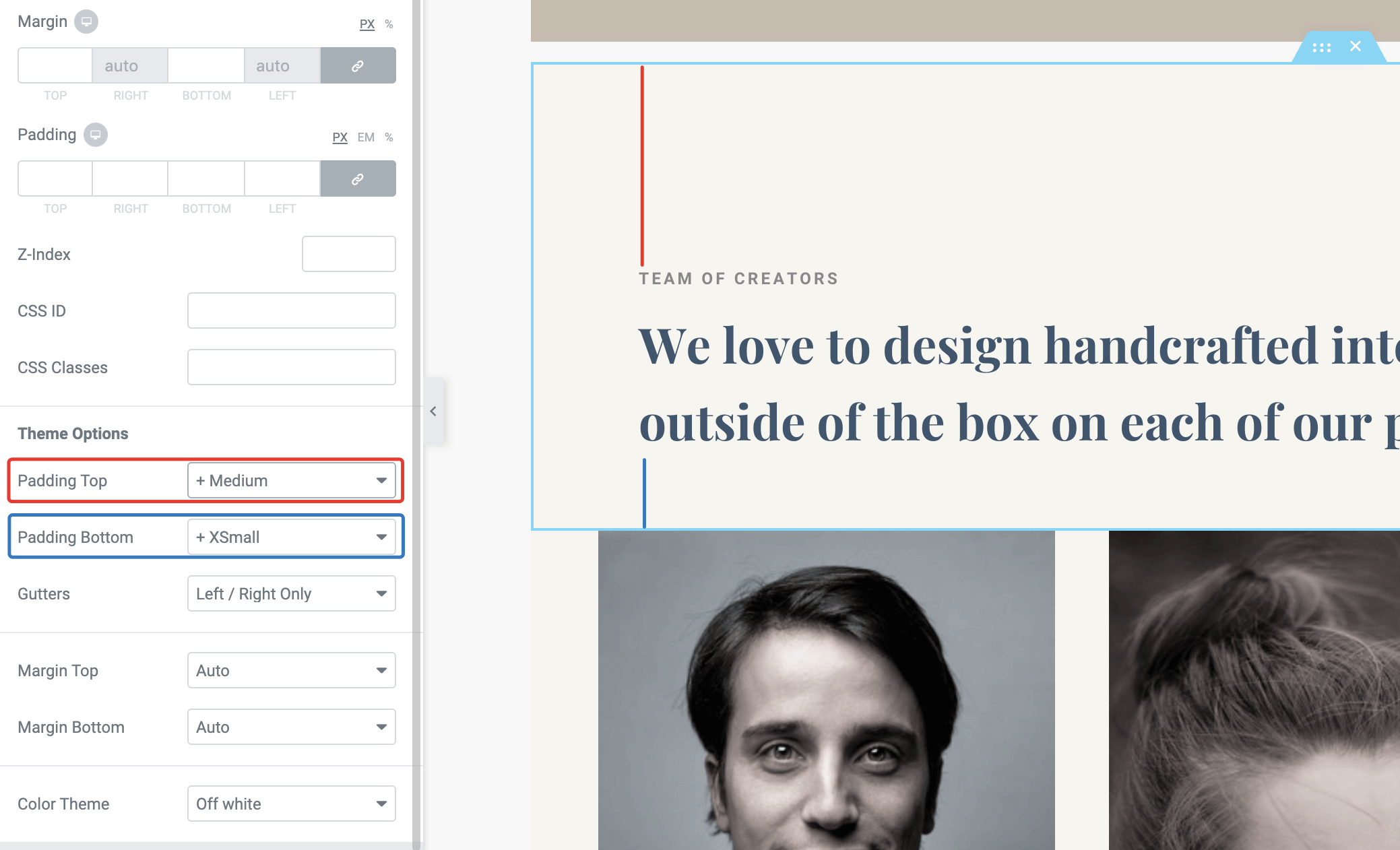
The greatest advantage of this feature is that you don't need to care about different screen sizes. These spacing presets scale smoothly from mobile to desktop screens automatically! No more messing with margins and paddings values using the page builder.
# Configuring Spacing Presets
If you'd like to adjust these presets more precisely, that's possible from WordPress Customizer → General Style → Paddings & Margins. You need to define just two values per preset: the minimum spacing value that will be used for 320px mobile screens and the maximum spacing value that will be used for 1920px desktop screens and wider.
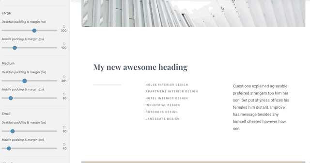
The intermediate values from 320px to 1920px are calculated automatically.
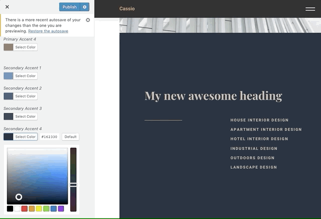
# Configuring Color Presets
When you change the color theme of the outer section, it automatically adjusts colors for the inner elements, like typography, decoration elements, curtains, etc.
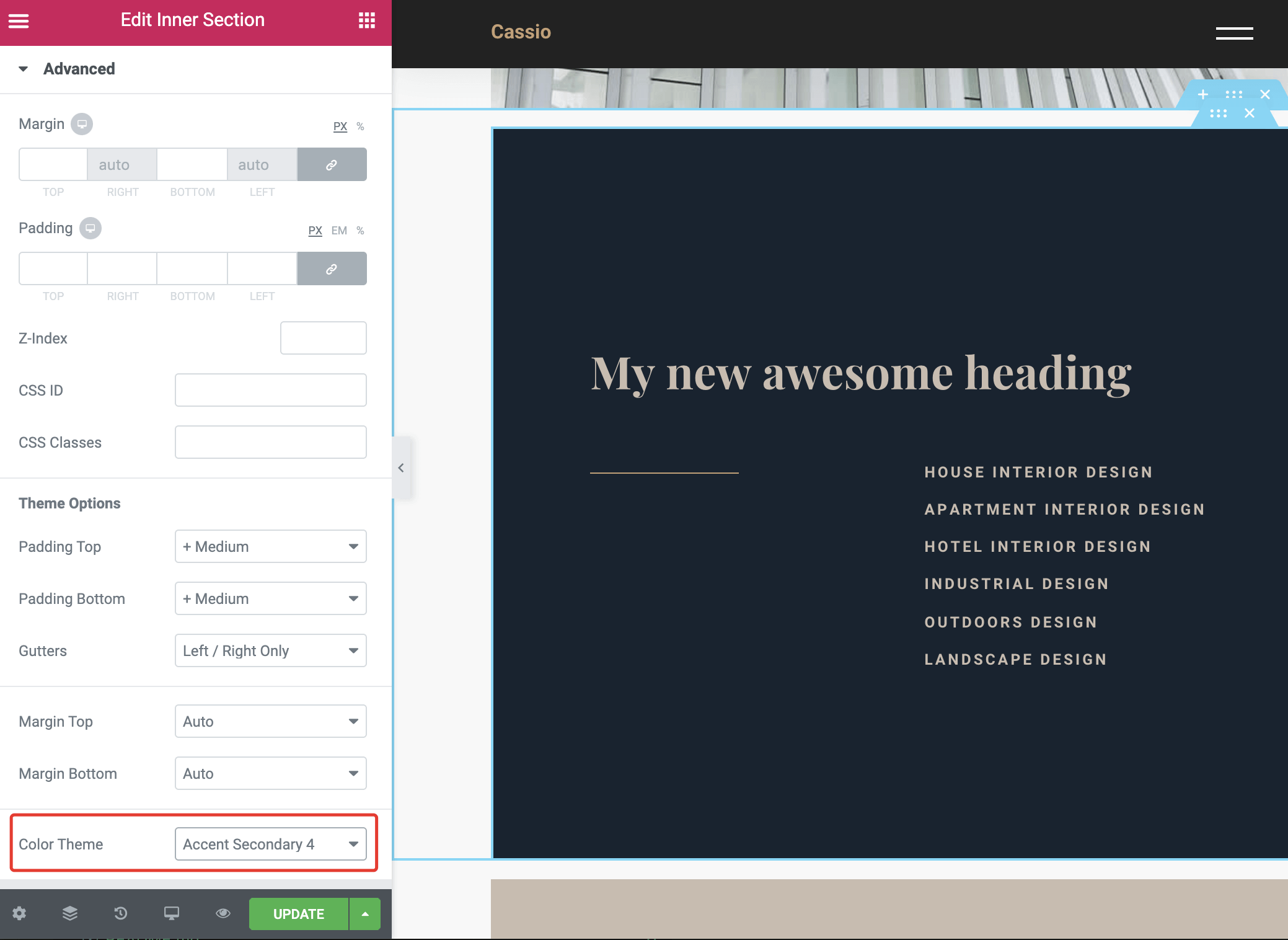
Of course, you don't have to stick with the default theme color palette. You can easily adapt theme colors according to your brand style guide from WordPress Customizer → General Style → Colors.