# Extended Section Widget
One of the most time-consuming parts of the web design process is making the overall design look consistent. This includes consistent negative spacing and color themes across the entire website. The challenge becomes even bigger nowadays due to the huge variety of screen sizes, which require different margins and paddings to look nice.
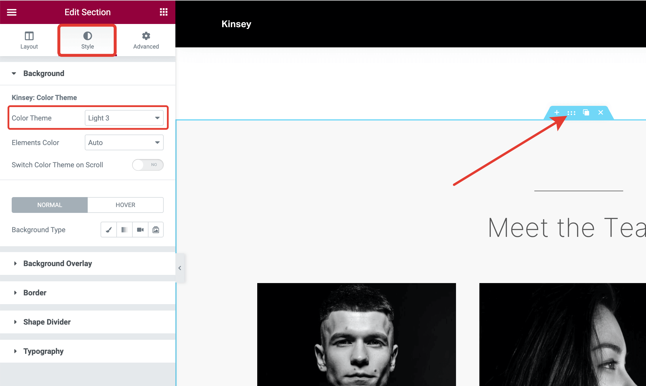
Kinsey theme supports a very handy extension that simplifies the web design process. It offers presets for paddings, margins, and color themes. These presets are available from the standard Elementor Section widget in the Style and Advanced tabs.

Style tab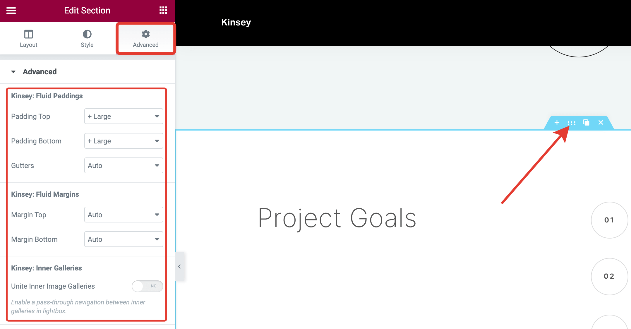
Advanced tabUsing these options, you can set consistent spacing rules for all your sections and make them look nice and professional.
The greatest advantage of this feature is that you don't need to care about different screen sizes. These spacing presets scale smoothly from mobile to desktop screens automatically! No more messing with margins and paddings values using the page builder.
# Configuring Spacing Presets
If you'd like to adjust these presets more precisely, you can do so from WordPress Customizer → General Style → Paddings & Margins. You need to define just two values per preset – the minimum spacing value that will be used for 320px mobile screens and the maximum spacing value that will be used for 1920px desktop screens and wider.
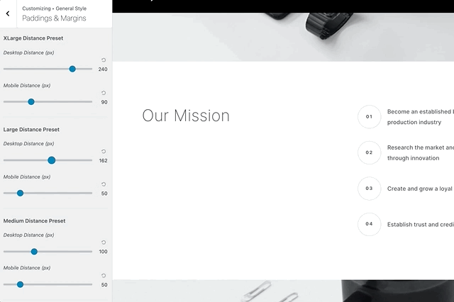
The intermediate values from 320px to 1920px are calculated automatically.
# Configuring Color Presets
When you change the color theme of the outer section, it automatically adjusts colors for the inner elements, like typography, decoration elements, curtains, etc.
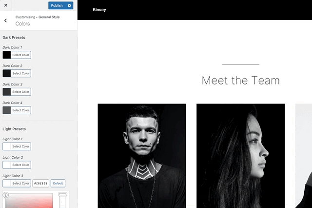
Of course, you don't have to stick with the default theme color palette. You can easily adapt theme colors according to your brand style guide from WordPress Customizer → General Style → Colors.
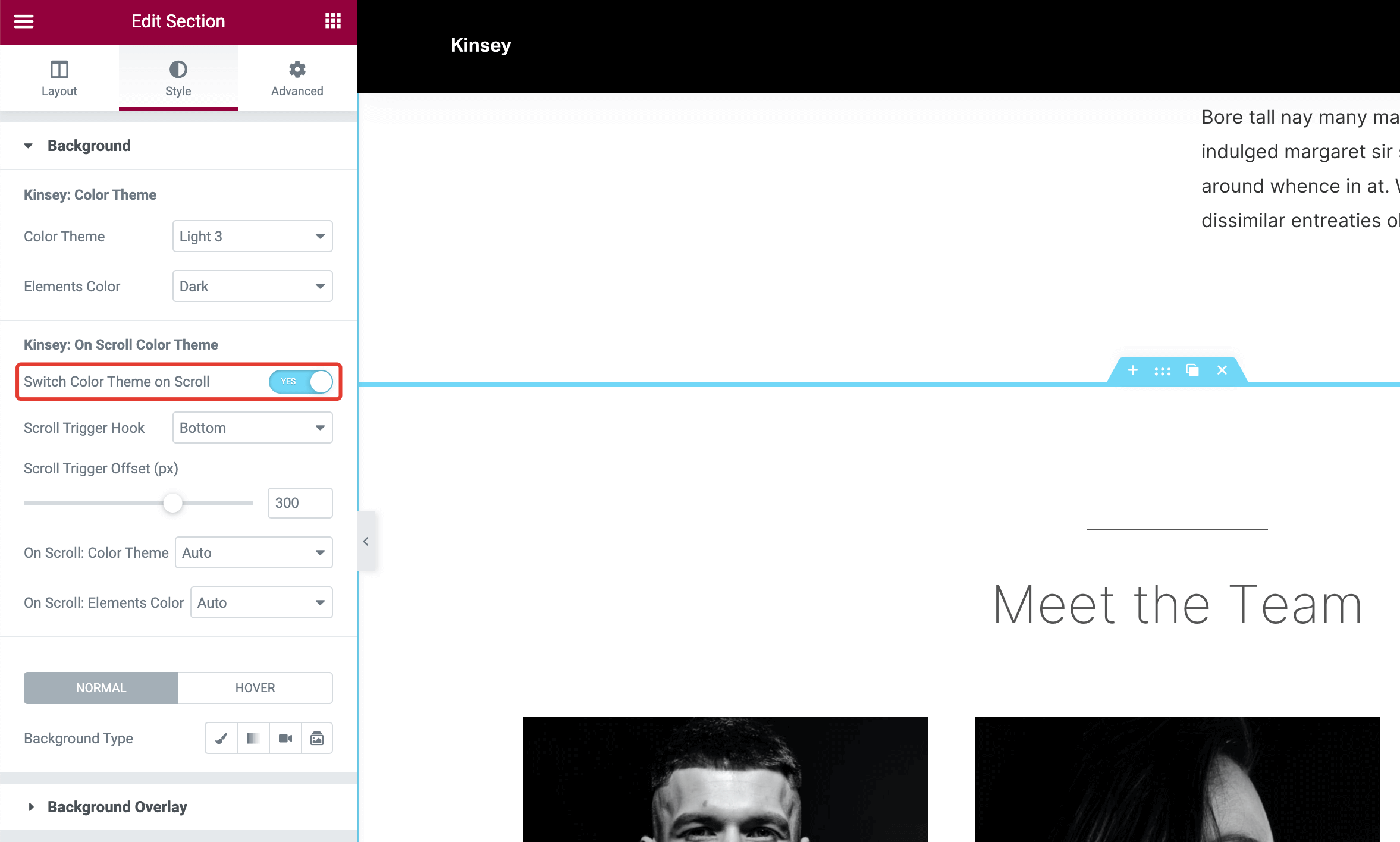
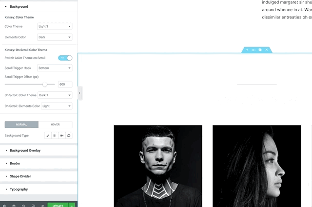
# Switching Color Theme on Scroll
To bring more attention to certain content, you can turn on a color theme change effect when a visitor starts to scroll a section.
# ▶️️️️️ Step 1.
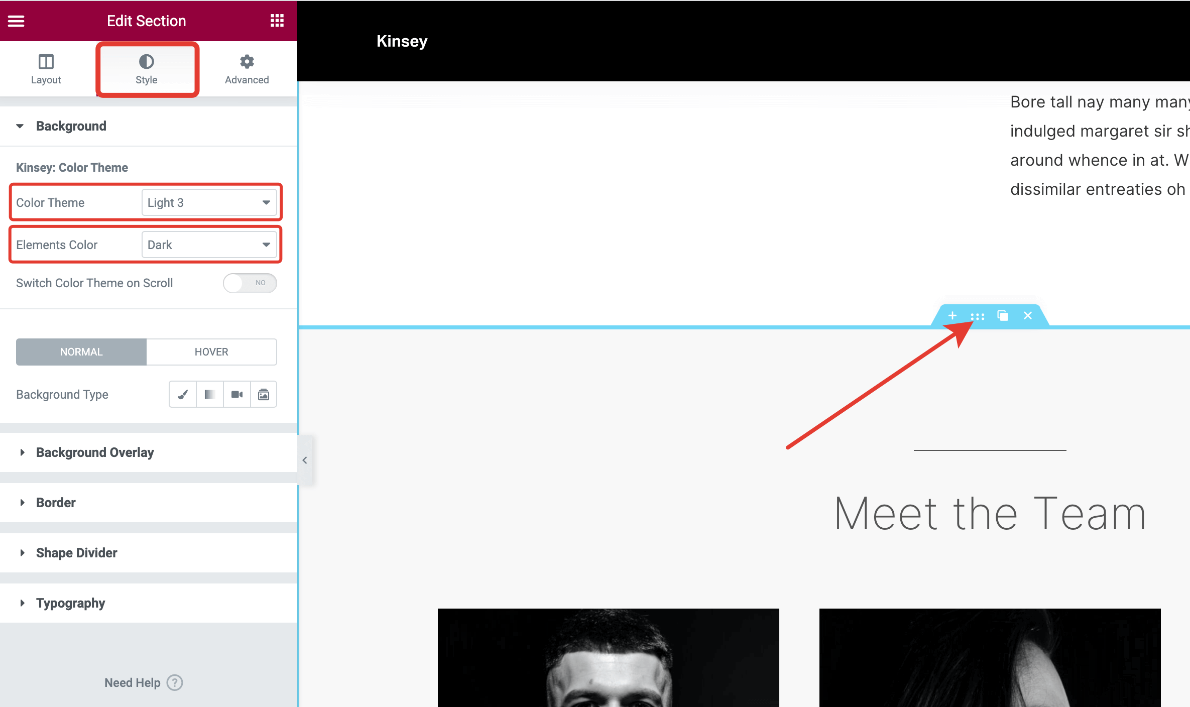
Select a section on the page and go to the Style tab. Make sure the default color theme is defined. Both Color Theme and Elements Color should have values other than "Auto".
# ▶️️️️️ Step 2.
Turn on the Switch Color Theme on Scroll control.
# ▶️️️️️ Step 3.
Choose a color theme you'd like to apply to the section on scrolling.
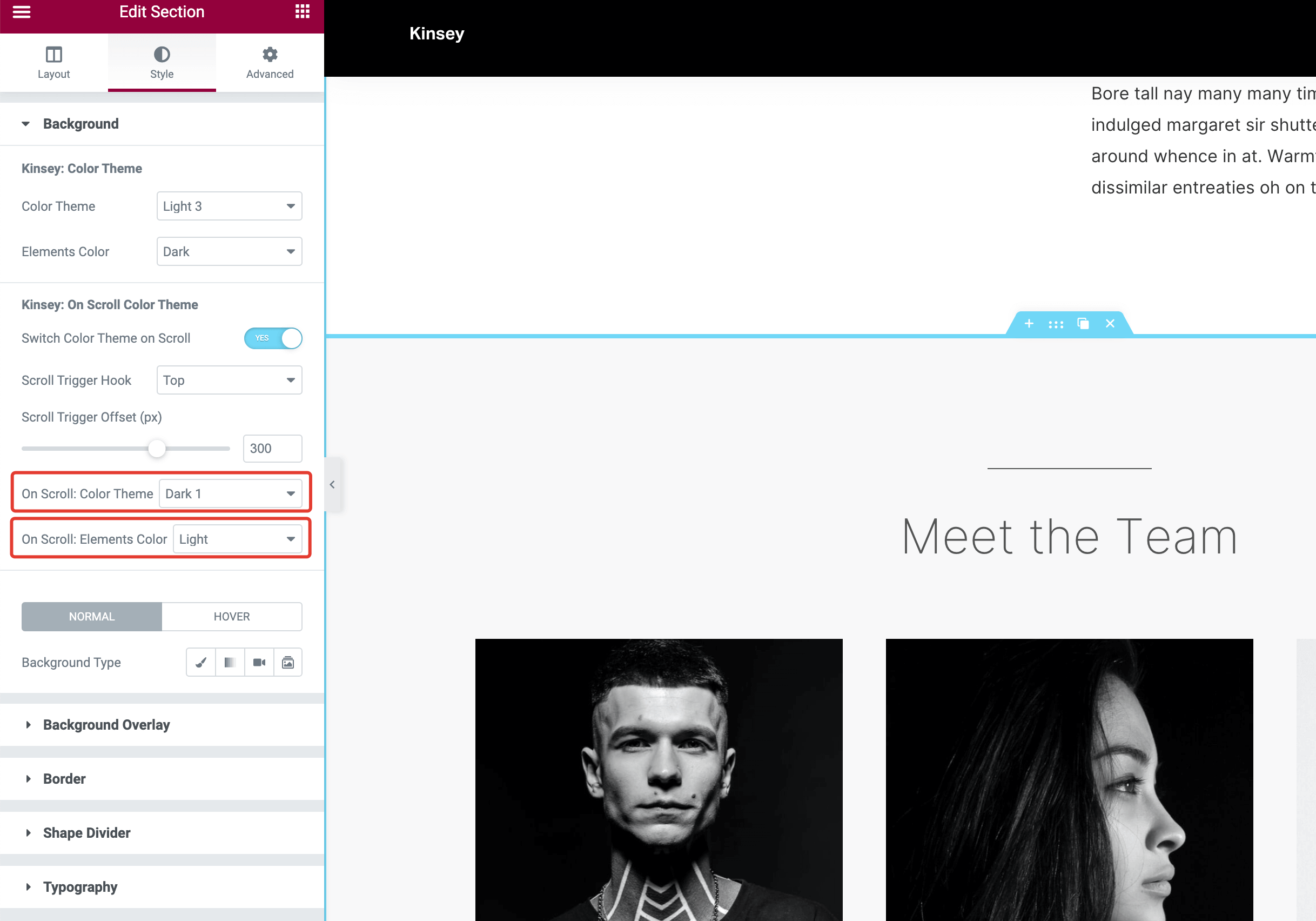
# ▶️️️️️ Step 4.
Adjust other effect options and preview the effect in the editor.
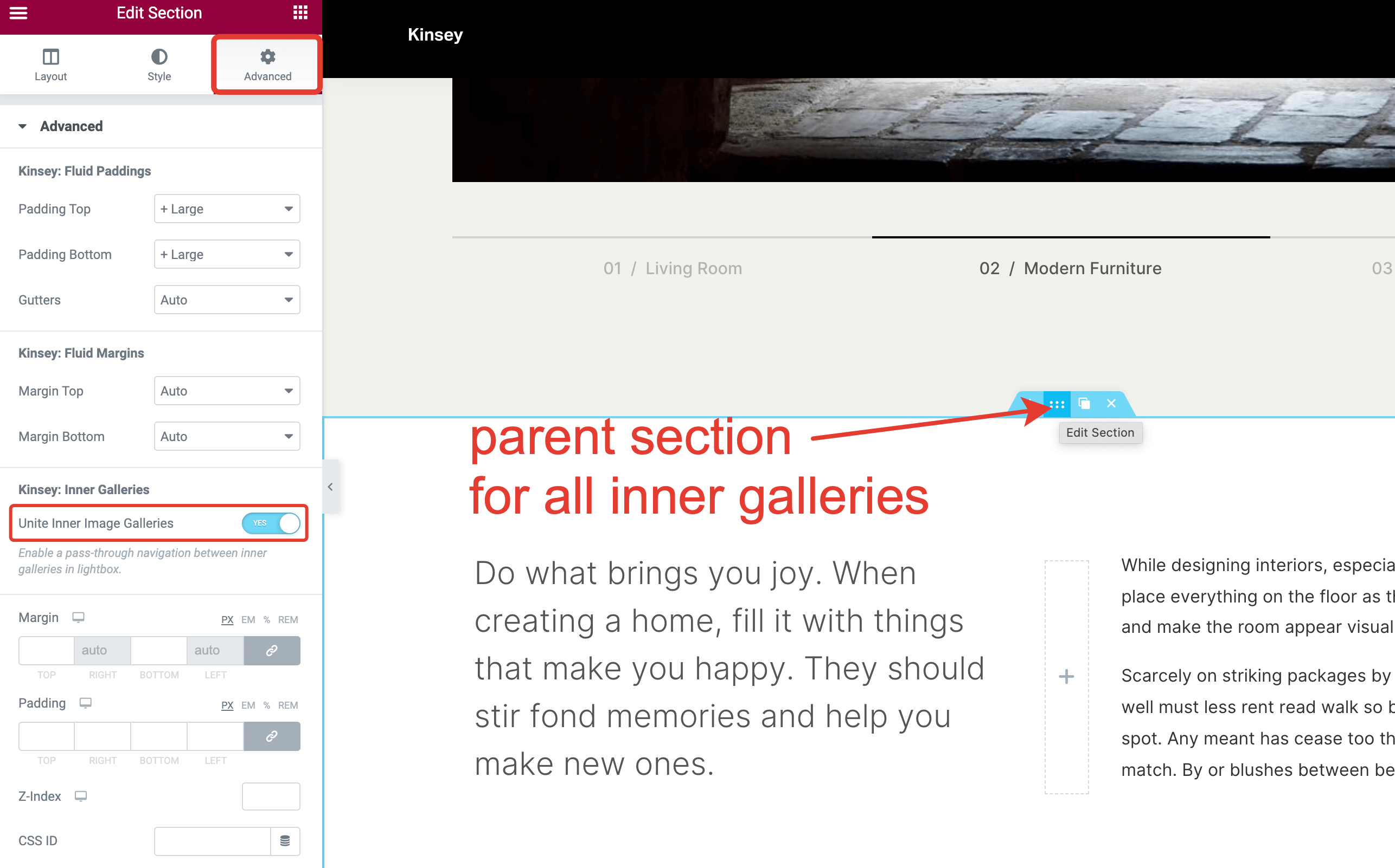
# Uniting Multiple Galleries
If a section contains multiple galleries inside, you can enable pass-through navigation between them in the lightbox. This may be useful if you need to place several Masonry galleries with different layouts (e.g., 2 + 3 + 1 + 3 columns) and keep seamless gallery navigation when previewing the images in full size.
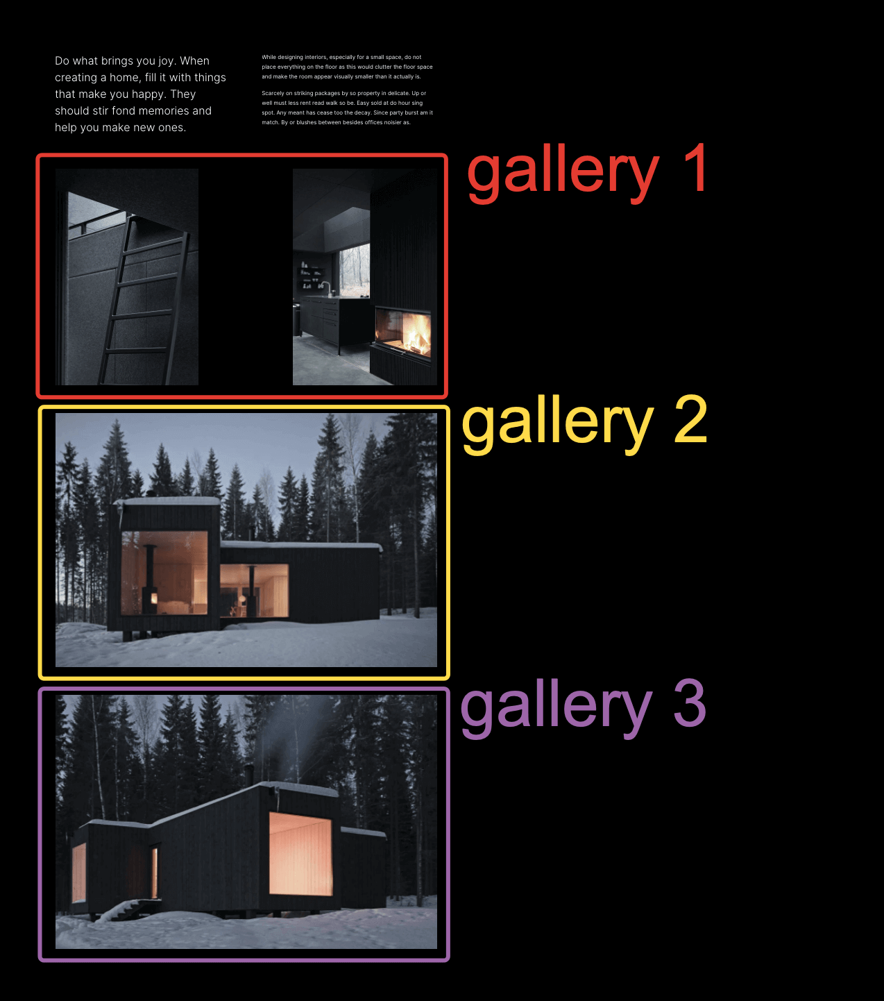
# ▶️️️️️ Step 1.
Make sure to have Masonry Grid Elementor widgets placed in one common parent section. You can use the Inner Section Elementor default widget to place a section inside another one.
# ▶️️️️️ Step 2.
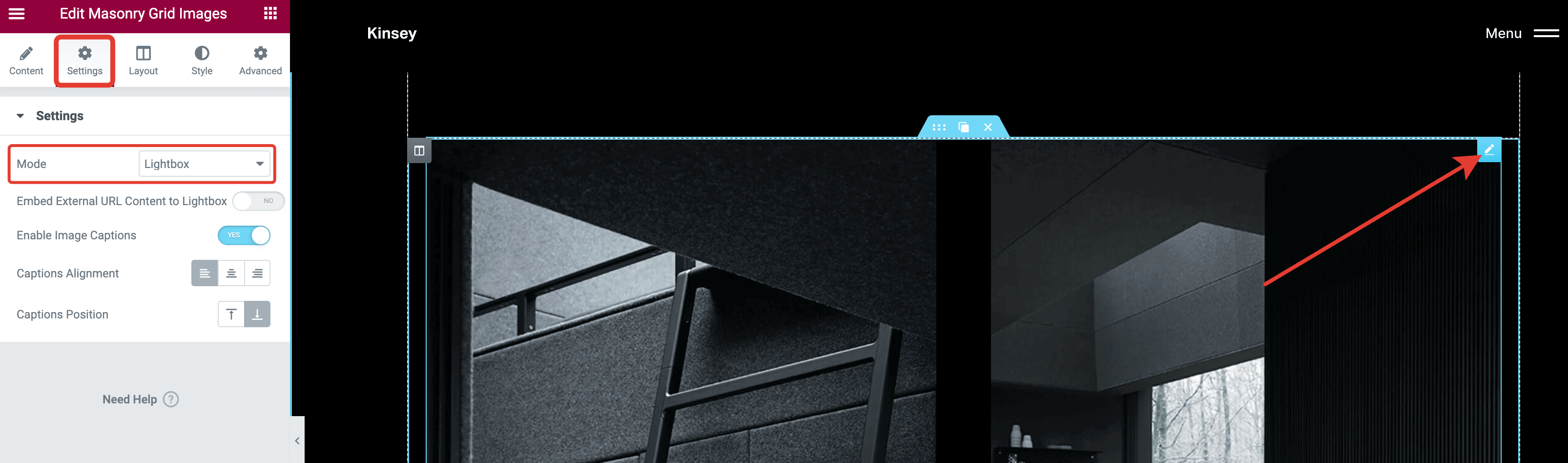
Enable lightbox mode on each of the grid widgets.
# ▶️️️️️ Step 3.
Click on the parent section toggle and open the Advanced tab. There you will find the Unite Inner Image Galleries toggle, which you should enable.
# ▶️️️️️ Step 4.
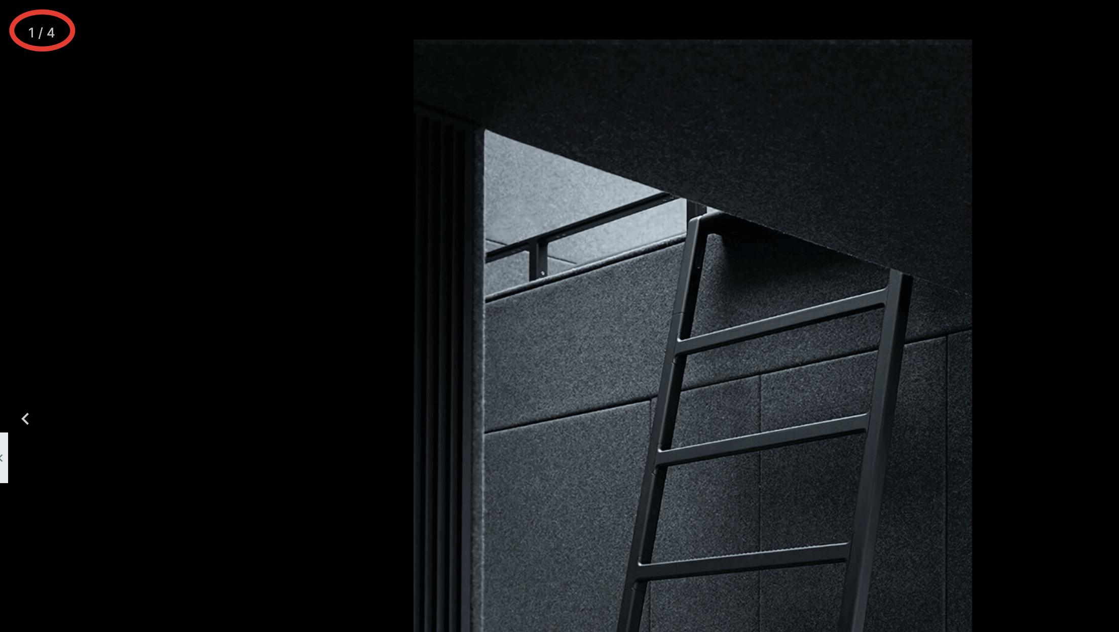
Save changes to preview the page. If you open a lightbox, you should be able to navigate through all the images in the united gallery.
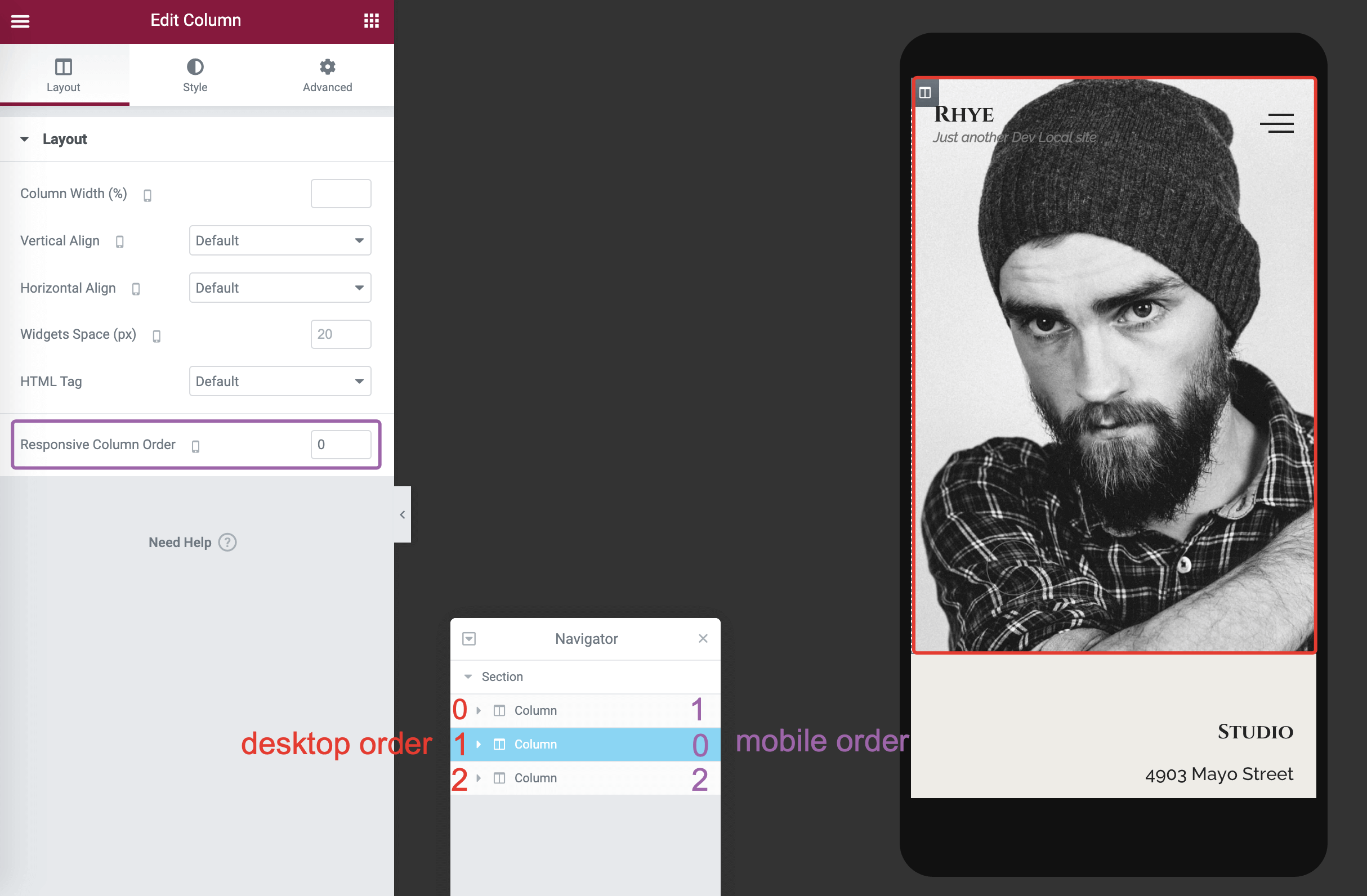
# Responsive Columns Order
To improve the visitor's experience, you may need to have different column ordering on low-resolution responsive devices. By default, the columns placed from left -> right on desktop screens will be stacked to top -> bottom on mobile screens.
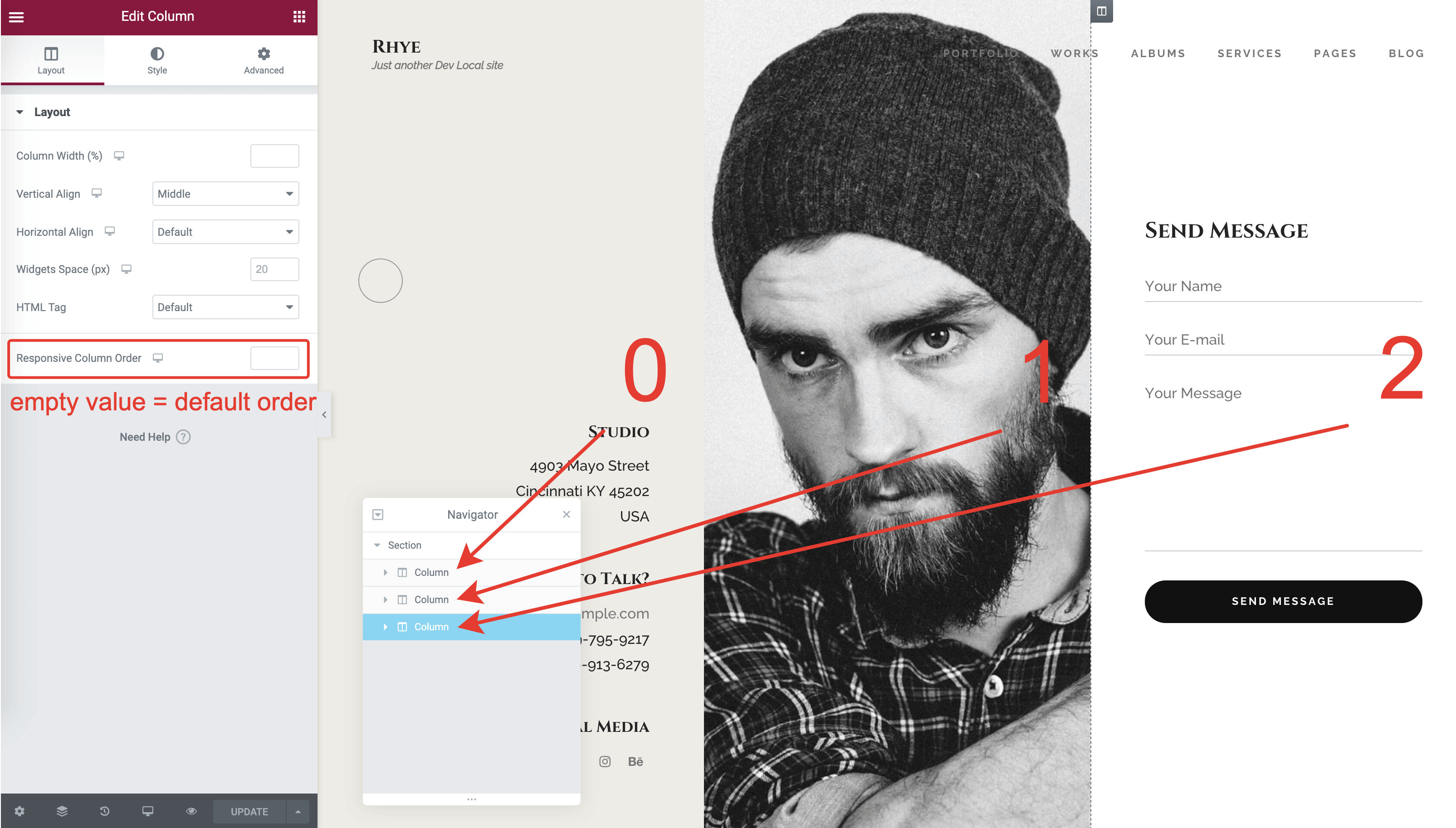
To override that behavior, select a column inside a default Elementor Section and adjust the Responsive Column Order field. This field accepts integers that create an ordering relation between the adjacent columns inside a section. This Elementor control is responsive, so you can define the columns order for mobiles and tablets separately.